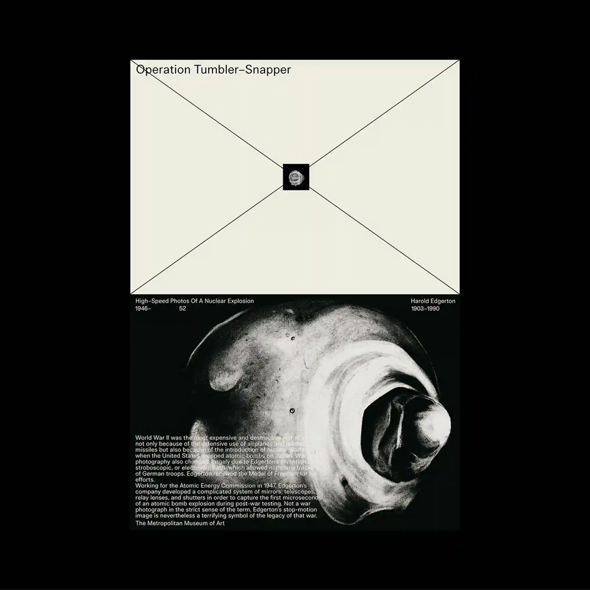
The surface is built from stacked rectangular panels of different sizes, producing a clear vertical rhythm through repeated blocks and abrupt transitions. Restrained serif typography is used at a relatively small scale, allowing generous spacing and subtle alignment shifts to define the hierarchy. A pale upper panel is crossed by diagonal construction lines that converge on a tiny central square, while the lower section contains a large grayscale shell-like photograph and a compact text block. The contrast between image fragments and restrained type creates a cinematic pacing, with the eye moving between isolated moments rather than a continuous field.
서로 다른 크기의 직사각형 패널을 위아래로 쌓아 반복되는 블록과 급격한 전환으로 뚜렷한 세로 리듬을 형성함. 절제된 세리프 타이포그래피를 비교적 작은 크기로 사용하며 넉넉한 간격과 미세한 정렬 변화로 위계를 구분함. 밝은 상단 패널에는 작은 중앙 사각형으로 모이는 대각선 구조선이 그어지고, 하단에는 큰 흑백 조개형 사진과 작은 텍스트 블록이 배치됨. 이미지 조각과 절제된 타이포그래피의 대비가 영화적인 호흡을 만들며 시선이 연속된 면보다 분리된 순간들 사이를 이동하게 함.
画面由不同尺寸的矩形面板上下堆叠而成,通过重复区块与突然的转换形成清晰的纵向节奏。 克制的衬线字体以较小尺度出现,通过宽松间距与细微对齐变化建立层级。 浅色上方面板由汇聚到微小中央方块的对角结构线构成,下部则放置大型灰度贝壳状照片与紧凑文字区块。 影像碎片与克制文字之间的对比形成电影式节奏,使视线在彼此分离的瞬间之间移动,而非停留于连续表面。