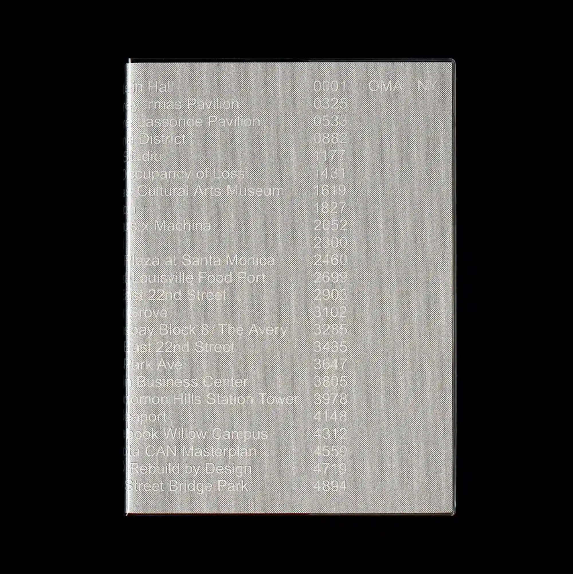
Typography occupies most of the page and functions as the primary image, with letterforms treated as large spatial masses rather than only carriers of information. Monospaced and data-like typography is arranged in repeated rows and columns, giving the text the character of measurements, indexes, or coded information. A long list of names and numbers is printed over a softly blurred gray surface, with uneven tonal patches and low-contrast texture making the data appear partially embedded in the material. Soft tonal transitions and selective color accents create an atmospheric surface where texture and spacing carry as much weight as typography.
타이포그래피가 페이지 대부분을 차지하며 문자 형태가 단순한 정보 전달을 넘어 큰 공간 덩어리처럼 주된 이미지로 기능함. 고정폭 및 데이터형 타이포그래피를 반복되는 행과 열로 배치해 텍스트가 측정값, 인덱스, 코드 정보처럼 보이게 함. 긴 이름과 숫자 목록이 부드럽게 흐려진 회색 표면 위에 인쇄되고 불균일한 명암 얼룩과 낮은 대비 질감이 데이터가 재료 속에 일부 스며든 듯 보이게 함. 부드러운 색조 전환과 선택적인 색상 포인트가 타이포그래피만큼 질감과 간격이 중요한 분위기 있는 표면을 형성함.
文字占据页面大部分区域并成为主要图像,字形被当作大型空间体量,而不仅是信息载体。 等宽与数据化字体以重复的行列排列,使文字呈现测量值、索引或编码信息般的特征。 长串名称与数字印在柔和模糊的灰色表面上,不均匀明暗斑块与低对比纹理使数据仿佛部分嵌入材质之中。 柔和色调过渡与选择性色彩强调营造富有氛围的表面,使质感与间距拥有与文字同等的视觉重量。