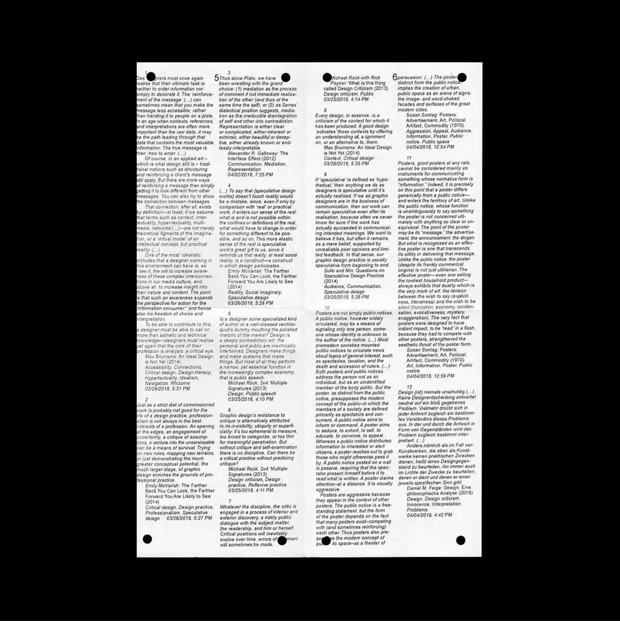
The entire surface is treated as a dense information field, with numerous small units packed closely enough to form an almost continuous visual texture. Narrow columns of small sans-serif type establish a controlled rhythm, while occasional larger words interrupt the grid and create focal points. Four narrow columns of tightly set text are divided by thin rules and dotted markers, giving the page the appearance of a dense newspaper or reference sheet. The careful sequencing of headings, captions, and images gives the piece the discipline of a publication page while retaining the impact of a poster.
수많은 작은 단위를 촘촘하게 배치해 페이지 전체가 거의 연속적인 시각 질감처럼 읽히는 고밀도 정보 영역으로 구성됨. 작은 산세리프 텍스트를 좁은 열로 정렬해 통제된 리듬을 만들고, 간헐적으로 등장하는 큰 글자가 그리드를 끊으며 초점을 형성함. 네 개의 좁은 텍스트 열이 얇은 선과 점 표식으로 나뉘며 페이지 전체가 조밀한 신문 지면이나 참고 문서처럼 보이게 함. 제목, 캡션, 이미지의 세심한 순서가 출판 페이지의 규율을 만들면서도 포스터 특유의 시각적 충격을 유지함.
整个表面被处理成高密度的信息场,大量微小单元紧密排列,几乎形成连续的视觉纹理。 小号无衬线文字以窄栏排列形成克制节奏,偶尔出现的大字号词语打断网格并形成视觉焦点。 四列狭窄文字由细线与点状标记分隔,使整页呈现密集报纸版面或参考资料般的感觉。 标题、说明与图像的精心编排赋予作品出版页面般的秩序,同时保留海报的视觉冲击力。