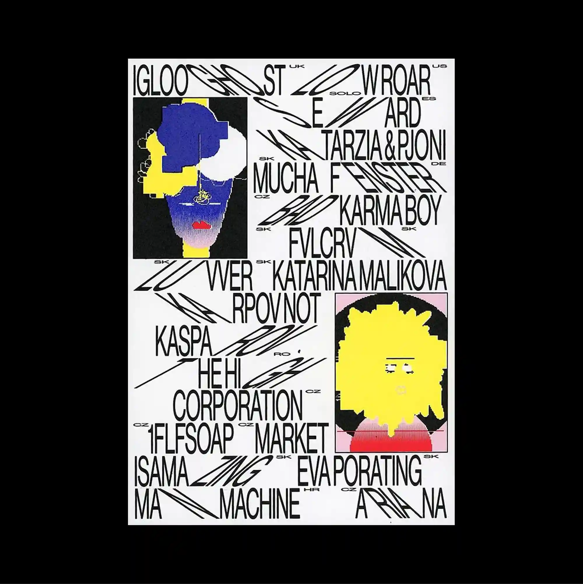
The entire surface is treated as a dense information field, with numerous small units packed closely enough to form an almost continuous visual texture. Different scripts, orientations, and typographic weights are mixed freely, producing a layered reading experience with no single dominant direction. Thin hand-drawn arrows and energetic black lines weave through tightly packed names, while blocky blue and yellow character-like figures punctuate the busy white surface. Unexpected alignments, playful shapes, and uneven spacing create a deliberately irregular rhythm that keeps the surface visually active.
수많은 작은 단위를 촘촘하게 배치해 페이지 전체가 거의 연속적인 시각 질감처럼 읽히는 고밀도 정보 영역으로 구성됨. 서로 다른 문자 체계와 방향, 굵기를 자유롭게 혼합해 하나의 지배적인 읽기 방향이 없는 다층적 읽기 경험을 형성함. 얇은 손그림 화살표와 역동적인 검정 선이 빽빽한 이름 사이를 누비고, 블록형 파란색과 노란색 캐릭터 형태가 복잡한 흰 화면에 포인트로 놓임. 예상 밖의 정렬, 장난스러운 형태, 불균일한 간격이 의도적으로 불규칙한 리듬을 만들며 화면을 지속적으로 활성화함.
整个表面被处理成高密度的信息场,大量微小单元紧密排列,几乎形成连续的视觉纹理。 不同文字体系、方向与字重被自由混合,形成没有单一主导方向的多层阅读体验。 细手绘箭头与活跃黑线穿梭于密集名称之间,块状蓝黄人物式形态则点缀繁忙的白色表面。 出乎意料的对齐、活泼形态与不均匀间距构成刻意不规则的节奏,使表面始终保持活跃。