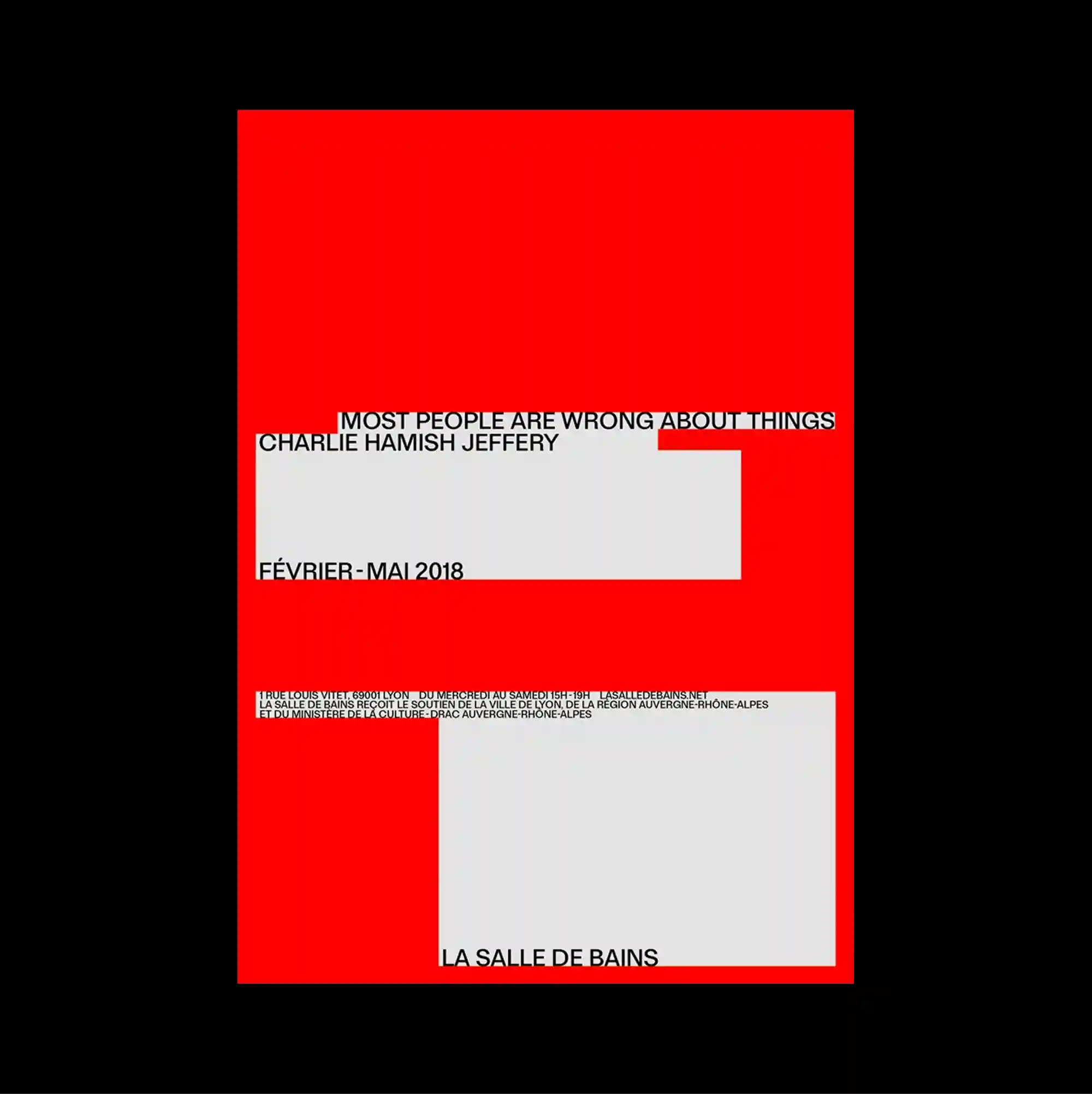
The design is divided into strongly contrasting color and image zones, using large rectangular fields to establish a clear structural hierarchy. Narrow columns of small sans-serif type establish a controlled rhythm, while occasional larger words interrupt the grid and create focal points. A saturated red field holds two pale rectangular panels and several thin bands of small text, creating a severe composition based almost entirely on flat color and proportion. Strong scale contrast and simplified spatial relationships make the composition immediately readable while preserving a distinctive experimental edge.
큰 직사각형 색면과 이미지 영역을 강하게 대비시켜 분할하고, 이를 통해 명확한 구조적 위계를 형성함. 작은 산세리프 텍스트를 좁은 열로 정렬해 통제된 리듬을 만들고, 간헐적으로 등장하는 큰 글자가 그리드를 끊으며 초점을 형성함. 강한 붉은색 면 위에 두 개의 밝은 직사각형 패널과 몇 줄의 작은 텍스트 띠가 놓여 평면 색상과 비례만으로 매우 엄격한 구성을 만듦. 강한 크기 대비와 단순화된 공간 관계 덕분에 즉각적으로 읽히면서도 독특한 실험적 성격을 유지함.
设计以强烈对比的色块与图像区域进行分割,并利用大面积矩形建立清晰的结构层级。 小号无衬线文字以窄栏排列形成克制节奏,偶尔出现的大字号词语打断网格并形成视觉焦点。 高饱和红色区域上放置两个浅色矩形面板与数条小文字带,几乎完全依靠平面色彩与比例构成严谨版面。 强烈尺度反差与简化的空间关系使构图能够被迅速识别,同时保留鲜明的实验性。