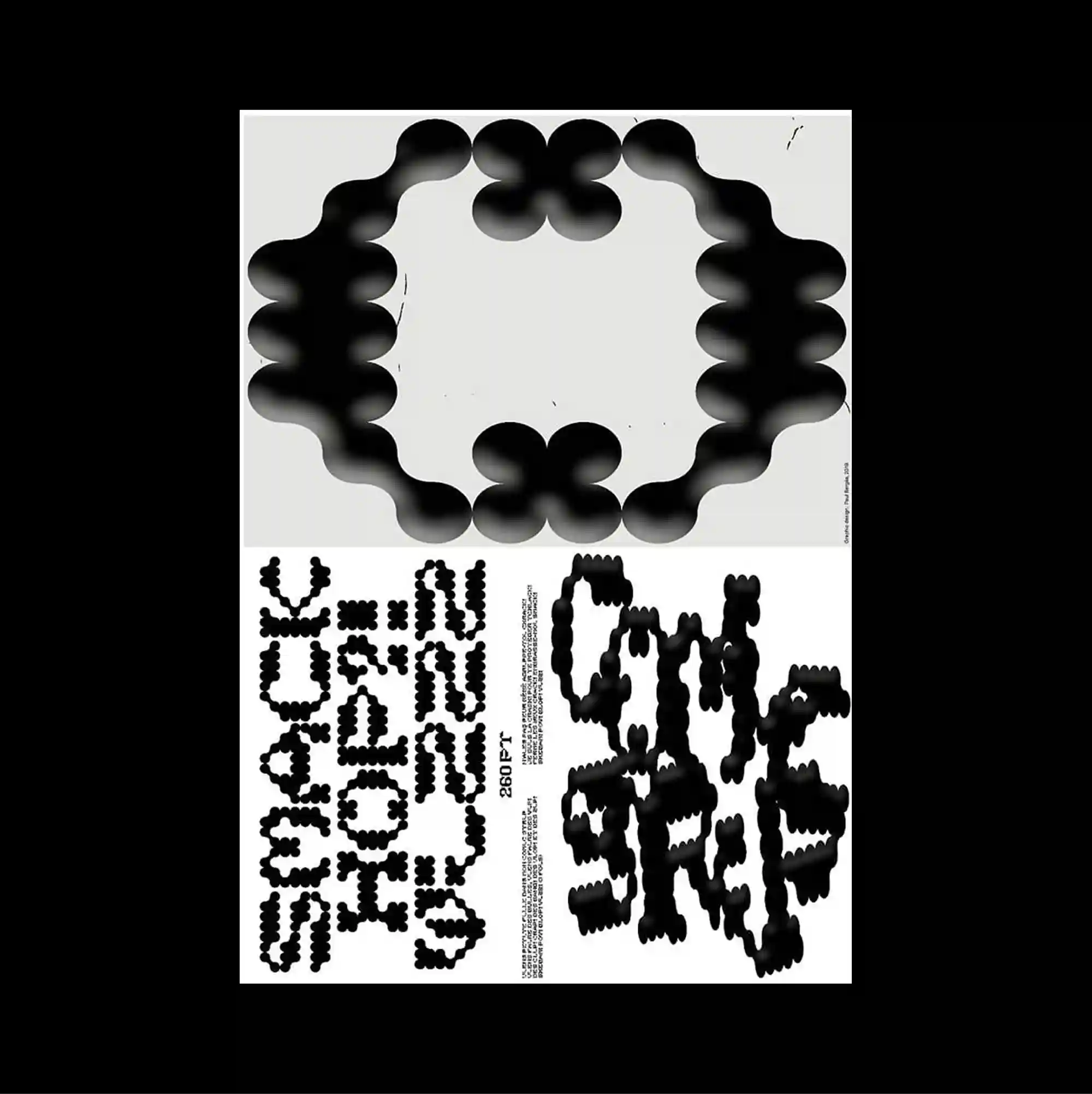
The surface is built from stacked rectangular panels of different sizes, producing a clear vertical rhythm through repeated blocks and abrupt transitions. Letterforms are stretched, distorted, cropped, or rotated until the typography begins to operate as an abstract graphic material. A ring of soft black organic blobs forms an open circular shape in the upper half, while heavily pixelated letterforms gather into two dense blocks below. Unexpected alignments, playful shapes, and uneven spacing create a deliberately irregular rhythm that keeps the surface visually active.
서로 다른 크기의 직사각형 패널을 위아래로 쌓아 반복되는 블록과 급격한 전환으로 뚜렷한 세로 리듬을 형성함. 문자 형태를 늘이거나 왜곡하고 잘라내거나 회전시켜 타이포그래피 자체가 추상적인 그래픽 재료처럼 작동하게 함. 부드러운 검정 유기 형태가 상단 절반에 열린 원형 고리를 만들고, 심하게 픽셀화된 글자 형태가 하단에서 두 개의 조밀한 블록으로 모임. 예상 밖의 정렬, 장난스러운 형태, 불균일한 간격이 의도적으로 불규칙한 리듬을 만들며 화면을 지속적으로 활성화함.
画面由不同尺寸的矩形面板上下堆叠而成,通过重复区块与突然的转换形成清晰的纵向节奏。 字形被拉伸、扭曲、裁切或旋转,使文字本身逐渐成为抽象的图形材料。 柔软黑色有机团块在上半部构成开放圆环,下方高度像素化的字形则聚成两个密集区块。 出乎意料的对齐、活泼形态与不均匀间距构成刻意不规则的节奏,使表面始终保持活跃。