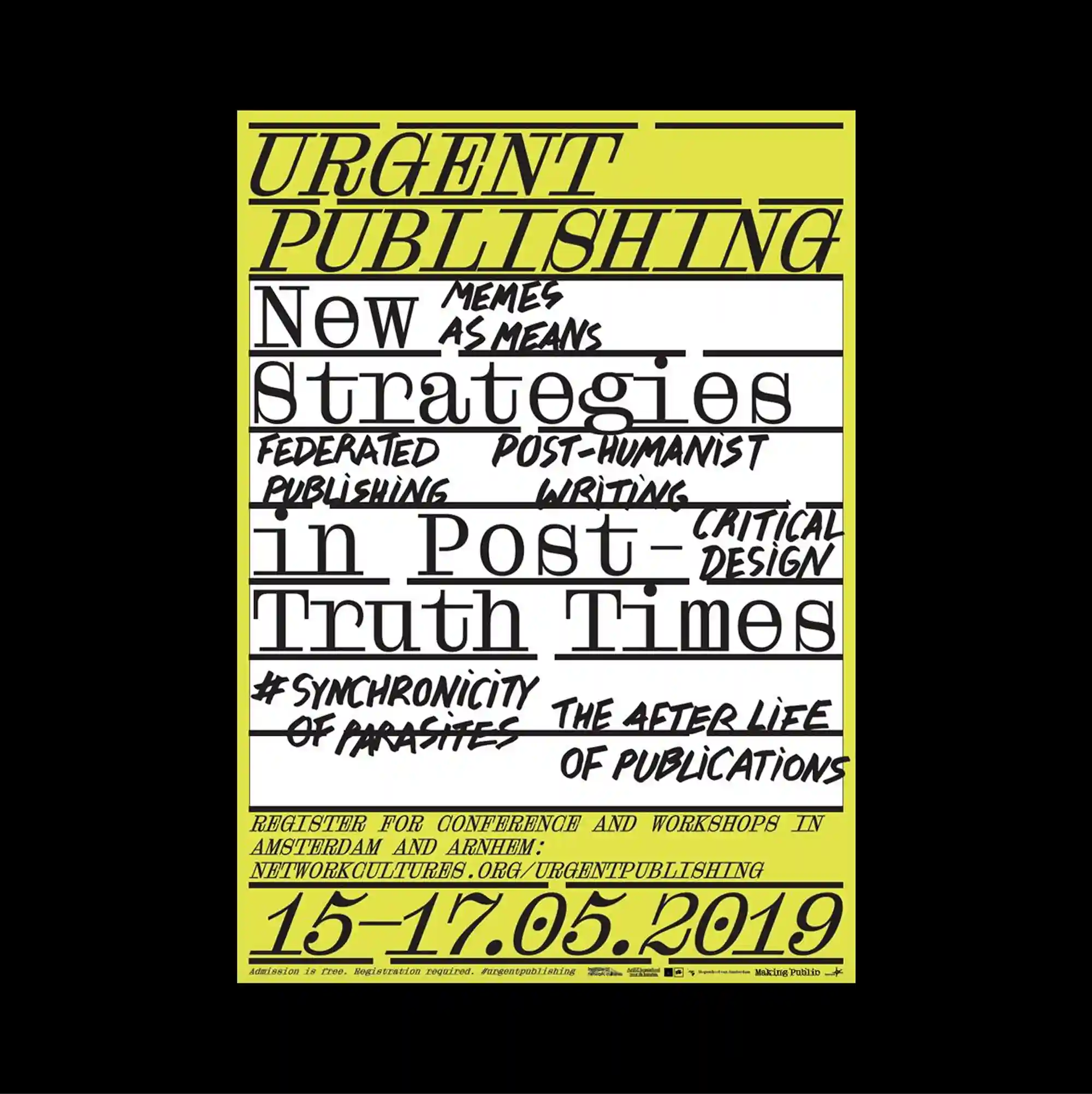
Typography occupies most of the page and functions as the primary image, with letterforms treated as large spatial masses rather than only carriers of information. Handwritten marks and informal annotations are layered over more systematic printed type, creating tension between spontaneous gestures and controlled typography. Handwritten and serif letterforms crowd a fluorescent yellow field, with thick underlines, uneven baselines, and stacked phrases creating an intentionally urgent visual texture. Bold color contrasts and abrupt shifts in scale produce an energetic graphic rhythm that remains legible despite the density of the elements.
타이포그래피가 페이지 대부분을 차지하며 문자 형태가 단순한 정보 전달을 넘어 큰 공간 덩어리처럼 주된 이미지로 기능함. 손글씨 흔적과 비정형 주석을 체계적인 인쇄 타이포그래피 위에 겹쳐 즉흥적인 제스처와 통제된 문자 사이의 긴장을 만듦. 손글씨와 세리프 글자가 형광 노란색 면을 빽빽하게 채우고 굵은 밑줄, 불균일한 기준선, 겹쳐진 문구가 의도적으로 긴박한 시각 질감을 만듦. 강한 색 대비와 갑작스러운 크기 변화가 요소가 많아도 읽힘을 유지하는 활기찬 그래픽 리듬을 만들어냄.
文字占据页面大部分区域并成为主要图像,字形被当作大型空间体量,而不仅是信息载体。 手写痕迹与随性注记叠加在系统化印刷字体之上,使即兴笔触与受控文字之间形成张力。 手写与衬线字形挤满荧光黄色区域,粗重下划线、不均匀基线与层叠词句共同形成刻意紧迫的视觉纹理。 强烈色彩对比与突变的尺度形成充满能量的图形节奏,即使元素密集仍保持清晰可读。