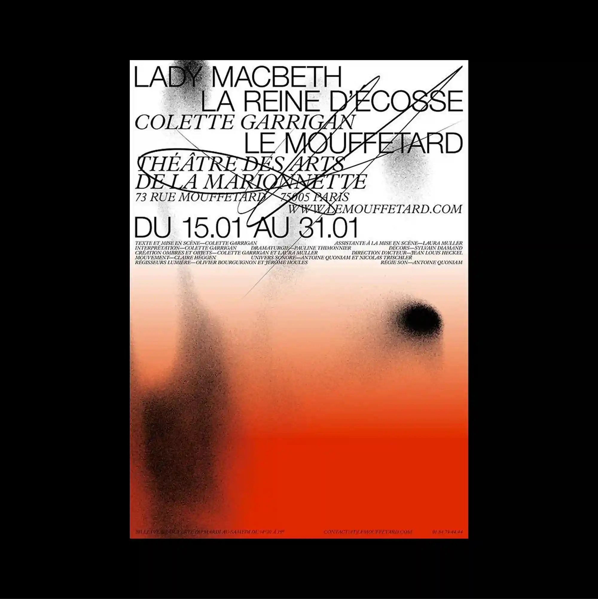
The design is divided into strongly contrasting color and image zones, using large rectangular fields to establish a clear structural hierarchy. Serif and sans-serif styles are mixed with thin rules and compact captions, producing a layered hierarchy through changes in weight, width, and alignment. Dense black serif text is concentrated at the top, while the lower half shifts into a soft orange gradient containing blurred dark silhouettes and one isolated circular spot. Soft tonal transitions and selective color accents create an atmospheric surface where texture and spacing carry as much weight as typography.
큰 직사각형 색면과 이미지 영역을 강하게 대비시켜 분할하고, 이를 통해 명확한 구조적 위계를 형성함. 세리프와 산세리프 서체를 얇은 선과 작은 캡션과 함께 혼합해 굵기, 폭, 정렬의 변화로 다층적인 위계를 형성함. 조밀한 검정 세리프 텍스트가 상단에 집중되고 하단 절반은 흐릿한 어두운 실루엣과 고립된 원형 점이 들어간 부드러운 오렌지 그라데이션으로 전환됨. 부드러운 색조 전환과 선택적인 색상 포인트가 타이포그래피만큼 질감과 간격이 중요한 분위기 있는 표면을 형성함.
设计以强烈对比的色块与图像区域进行分割,并利用大面积矩形建立清晰的结构层级。 衬线体与无衬线体结合细线和小型说明文字,通过字重、宽度与对齐方式的变化建立多层级关系。 密集黑色衬线文字集中在顶部,下半部则过渡为柔和橙色渐变,其中包含模糊深色轮廓与一个孤立圆点。 柔和色调过渡与选择性色彩强调营造富有氛围的表面,使质感与间距拥有与文字同等的视觉重量。