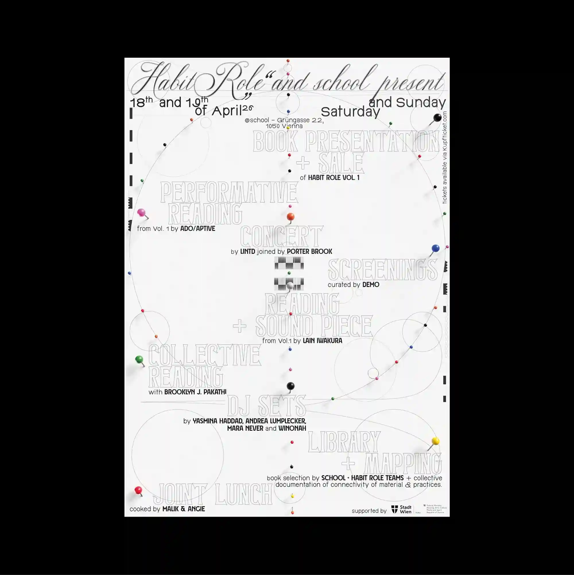
The entire surface is treated as a dense information field, with numerous small units packed closely enough to form an almost continuous visual texture. Typography is integrated with diagrams, coordinates, and graphic notation, so textual information and visual systems become difficult to separate. Faint repeated text covers the page beneath thin curved paths, small colored nodes, and circular diagram fragments, creating a layered network-like structure with a pale overall tone. The repeated structures make the poster read like a diagram or index, with visual meaning emerging from accumulation rather than a single focal image.
수많은 작은 단위를 촘촘하게 배치해 페이지 전체가 거의 연속적인 시각 질감처럼 읽히는 고밀도 정보 영역으로 구성됨. 타이포그래피를 다이어그램, 좌표, 그래픽 표기와 결합해 문자 정보와 시각 시스템이 분리되기 어려운 상태로 구성함. 희미하게 반복되는 텍스트 위로 가는 곡선 경로, 작은 색상 노드, 원형 다이어그램 조각이 겹쳐져 밝은 톤의 네트워크형 구조를 만듦. 반복 구조가 포스터를 다이어그램이나 인덱스처럼 보이게 하며 단일 초점 이미지보다 요소의 축적에서 시각적 의미가 형성됨.
整个表面被处理成高密度的信息场,大量微小单元紧密排列,几乎形成连续的视觉纹理。 文字与图解、坐标和图形符号相互结合,使文本信息与视觉系统几乎无法分离。 淡淡重复文字铺在底层,其上叠加细曲线路径、小型彩色节点与圆形图解碎片,形成浅色调的网络式结构。 重复结构使海报呈现图解或索引般的特征,视觉意义更多来自元素累积而非单一焦点图像。