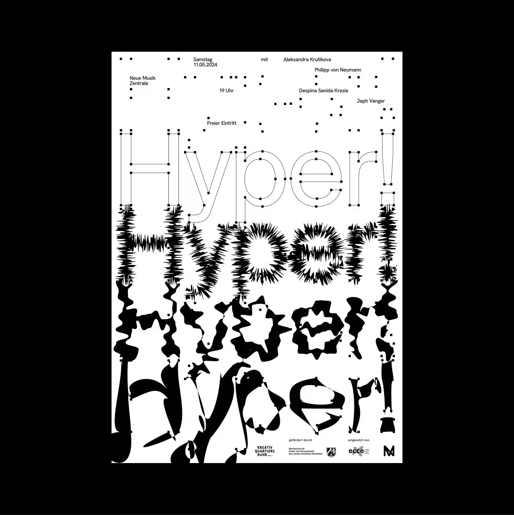
Typography occupies most of the page and functions as the primary image, with letterforms treated as large spatial masses rather than only carriers of information. Letterforms are stretched, distorted, cropped, or rotated until the typography begins to operate as an abstract graphic material. The lower half is filled with heavily distorted black display lettering whose edges become jagged and textured, while small metadata-like type remains comparatively calm above. The compressed layering and hard contrasts produce a dense industrial character, with information behaving almost like a physical surface.
타이포그래피가 페이지 대부분을 차지하며 문자 형태가 단순한 정보 전달을 넘어 큰 공간 덩어리처럼 주된 이미지로 기능함. 문자 형태를 늘이거나 왜곡하고 잘라내거나 회전시켜 타이포그래피 자체가 추상적인 그래픽 재료처럼 작동하게 함. 하단 절반은 가장자리가 거칠고 질감화된 강하게 왜곡된 검정 디스플레이 글자로 채워지고 상단의 작은 메타데이터형 텍스트는 상대적으로 차분하게 유지됨. 압축된 중첩과 강한 대비가 조밀한 산업적 성격을 만들며 정보 자체가 물리적인 표면처럼 느껴지게 함.
文字占据页面大部分区域并成为主要图像,字形被当作大型空间体量,而不仅是信息载体。 字形被拉伸、扭曲、裁切或旋转,使文字本身逐渐成为抽象的图形材料。 下半部被高度扭曲的黑色展示字体填满,字缘呈锯齿与纹理化效果,而上方小型元数据式文字保持相对平静。 紧密叠层与强硬对比形成浓厚的工业感,使信息本身几乎像实体表面一样存在。