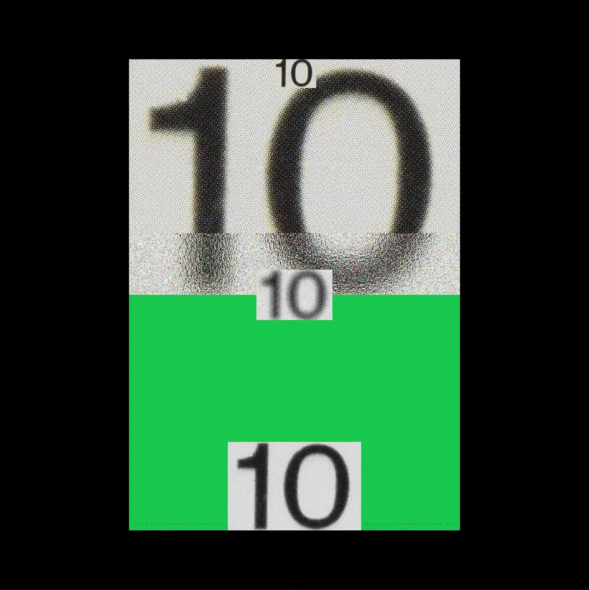
The design is divided into strongly contrasting color and image zones, using large rectangular fields to establish a clear structural hierarchy. Oversized display lettering is paired with dense micro-typography, creating an extreme scale contrast between headline forms and secondary information. A giant blurred numeral occupies the upper half and dissolves into a bright green lower block, where two smaller repeated number cards interrupt the flat color field. Strong scale contrast and simplified spatial relationships make the composition immediately readable while preserving a distinctive experimental edge.
큰 직사각형 색면과 이미지 영역을 강하게 대비시켜 분할하고, 이를 통해 명확한 구조적 위계를 형성함. 초대형 디스플레이 글자와 조밀한 미세 타이포그래피를 병치해 제목 형태와 보조 정보 사이에 극단적인 크기 대비를 만듦. 거대한 흐릿한 숫자가 상단 절반을 차지하며 선명한 녹색 하단 블록으로 이어지고, 두 개의 작은 반복 숫자 카드가 평평한 색면을 끊음. 강한 크기 대비와 단순화된 공간 관계 덕분에 즉각적으로 읽히면서도 독특한 실험적 성격을 유지함.
设计以强烈对比的色块与图像区域进行分割,并利用大面积矩形建立清晰的结构层级。 超大展示字体与密集微型文字并置,在标题形态与次要信息之间制造极端的尺度反差。 巨大的模糊数字占据上半部并融入明亮绿色下方区块,两张较小的重复数字卡片打断平坦色面。 强烈尺度反差与简化的空间关系使构图能够被迅速识别,同时保留鲜明的实验性。