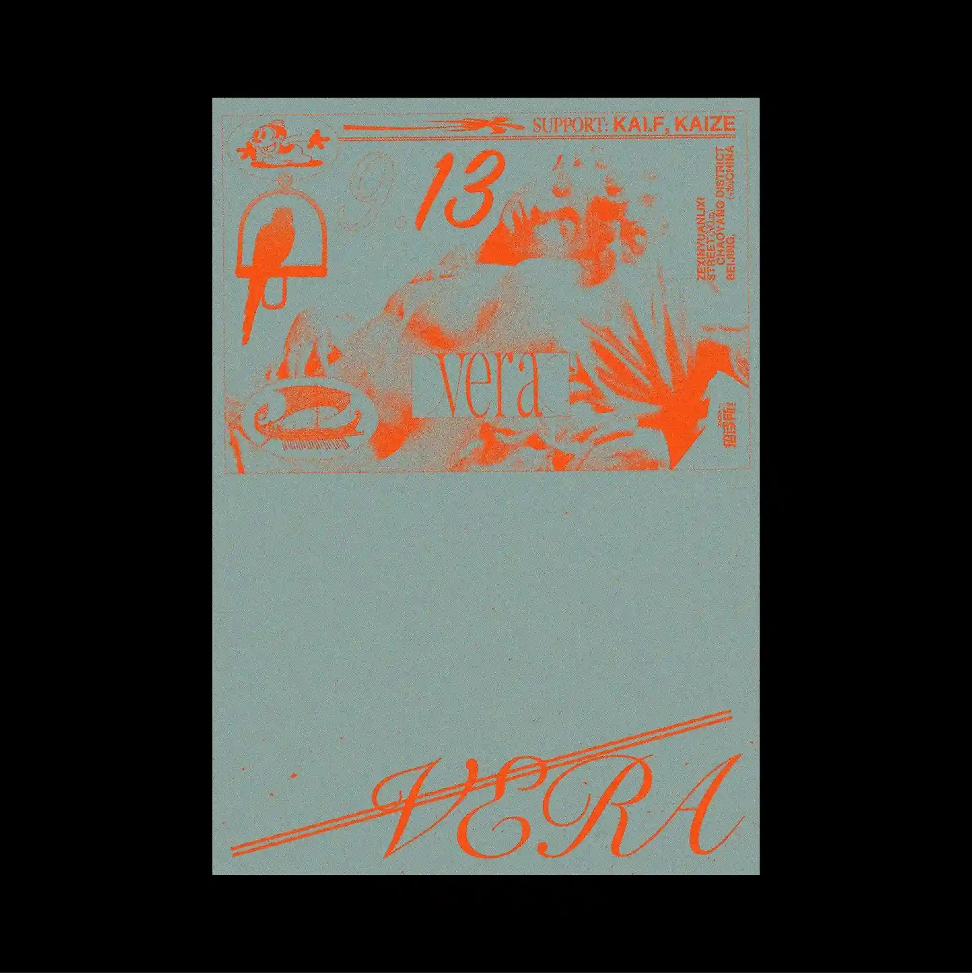
The poster separates a compact image band from a larger lower field, creating a two-part structure with a pronounced shift in density between the sections. Handwritten marks and informal annotations are layered over more systematic printed type, creating tension between spontaneous gestures and controlled typography. Orange sketches, fragments of illustration, and hand-drawn lettering gather across the top of a muted gray-green sheet, while a large sweeping script line anchors the lower edge. Visible grain, imperfect edges, and mixed image qualities introduce a tactile analog character that softens the underlying grid.
작은 이미지 띠와 더 넓은 하단 영역을 분리해 두 부분의 밀도가 뚜렷하게 달라지는 이중 구조를 형성함. 손글씨 흔적과 비정형 주석을 체계적인 인쇄 타이포그래피 위에 겹쳐 즉흥적인 제스처와 통제된 문자 사이의 긴장을 만듦. 오렌지색 스케치, 삽화 조각, 손그림 글자가 탁한 회녹색 페이지 상단에 모이고 크게 휘어진 필기체 선이 하단 가장자리를 고정함. 보이는 입자감, 불완전한 가장자리, 서로 다른 이미지 질감이 촉각적인 아날로그 성격을 더해 기저의 그리드를 부드럽게 완화함.
海报将紧凑的图像带与更大的下方区域分开,形成上下两部分密度明显不同的结构。 手写痕迹与随性注记叠加在系统化印刷字体之上,使即兴笔触与受控文字之间形成张力。 橙色草图、插画碎片与手绘文字集中在低饱和灰绿色页面上部,一道大型弧形手写线条则固定下缘。 可见颗粒、不完整边缘与不同影像质感带来触觉式模拟感,并柔化底层网格秩序。