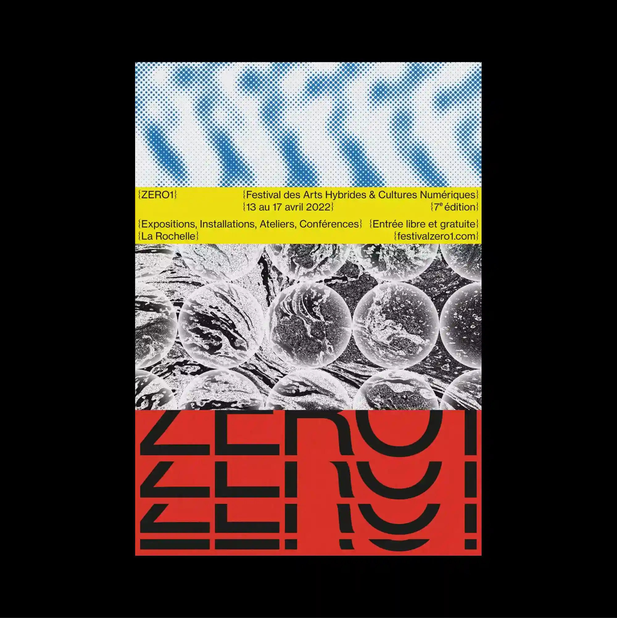
The surface is built from stacked rectangular panels of different sizes, producing a clear vertical rhythm through repeated blocks and abrupt transitions. Letterforms are stretched, distorted, cropped, or rotated until the typography begins to operate as an abstract graphic material. A blurred blue pattern sits above a narrow yellow information band, followed by a grayscale microscopic texture and a red lower block filled with repeated abstract letterforms. Bold color contrasts and abrupt shifts in scale produce an energetic graphic rhythm that remains legible despite the density of the elements.
서로 다른 크기의 직사각형 패널을 위아래로 쌓아 반복되는 블록과 급격한 전환으로 뚜렷한 세로 리듬을 형성함. 문자 형태를 늘이거나 왜곡하고 잘라내거나 회전시켜 타이포그래피 자체가 추상적인 그래픽 재료처럼 작동하게 함. 흐릿한 파란 패턴 아래에 좁은 노란 정보 띠가 놓이고 이어서 흑백 미세 질감과 반복 추상 글자가 채워진 붉은 하단 블록이 배치됨. 강한 색 대비와 갑작스러운 크기 변화가 요소가 많아도 읽힘을 유지하는 활기찬 그래픽 리듬을 만들어냄.
画面由不同尺寸的矩形面板上下堆叠而成,通过重复区块与突然的转换形成清晰的纵向节奏。 字形被拉伸、扭曲、裁切或旋转,使文字本身逐渐成为抽象的图形材料。 模糊蓝色图案下方接一条狭窄黄色信息带,随后是灰度微观质感与填满重复抽象字形的红色底部区块。 强烈色彩对比与突变的尺度形成充满能量的图形节奏,即使元素密集仍保持清晰可读。