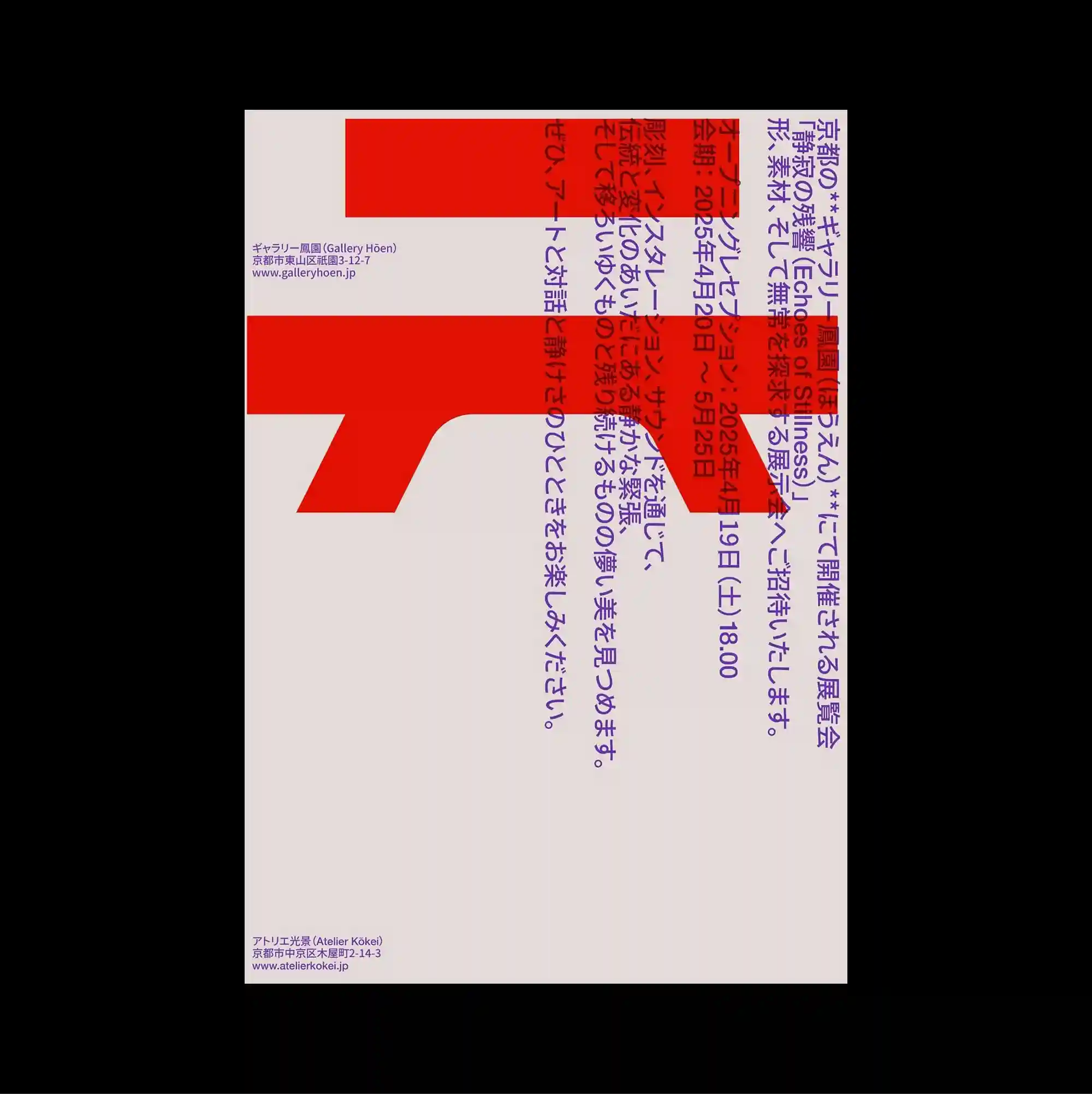
The surface is built from stacked rectangular panels of different sizes, producing a clear vertical rhythm through repeated blocks and abrupt transitions. Vertical East Asian type is combined with smaller horizontal information, creating multiple reading directions within the same tightly controlled structure. Broad red rectangles occupy the upper half while vertical blue and purple Japanese text crosses their edges, leaving a large pale lower field with minimal notation. Bold color contrasts and abrupt shifts in scale produce an energetic graphic rhythm that remains legible despite the density of the elements.
서로 다른 크기의 직사각형 패널을 위아래로 쌓아 반복되는 블록과 급격한 전환으로 뚜렷한 세로 리듬을 형성함. 세로 방향의 동아시아 문자와 작은 가로 정보를 결합해 하나의 통제된 구조 안에 여러 읽기 방향을 동시에 형성함. 넓은 붉은 직사각형이 상단 절반을 차지하고 파란색과 보라색 일본어 세로 텍스트가 그 경계를 가로지르며 하단은 최소한의 표기만 남긴 밝은 영역으로 비워짐. 강한 색 대비와 갑작스러운 크기 변화가 요소가 많아도 읽힘을 유지하는 활기찬 그래픽 리듬을 만들어냄.
画面由不同尺寸的矩形面板上下堆叠而成,通过重复区块与突然的转换形成清晰的纵向节奏。 竖排东亚文字与较小的横向信息结合,在同一严谨结构中形成多重阅读方向。 宽大的红色矩形占据上半部,蓝紫色日文竖排文字穿过其边缘,下半部则保留为只有少量标记的浅色空间。 强烈色彩对比与突变的尺度形成充满能量的图形节奏,即使元素密集仍保持清晰可读。