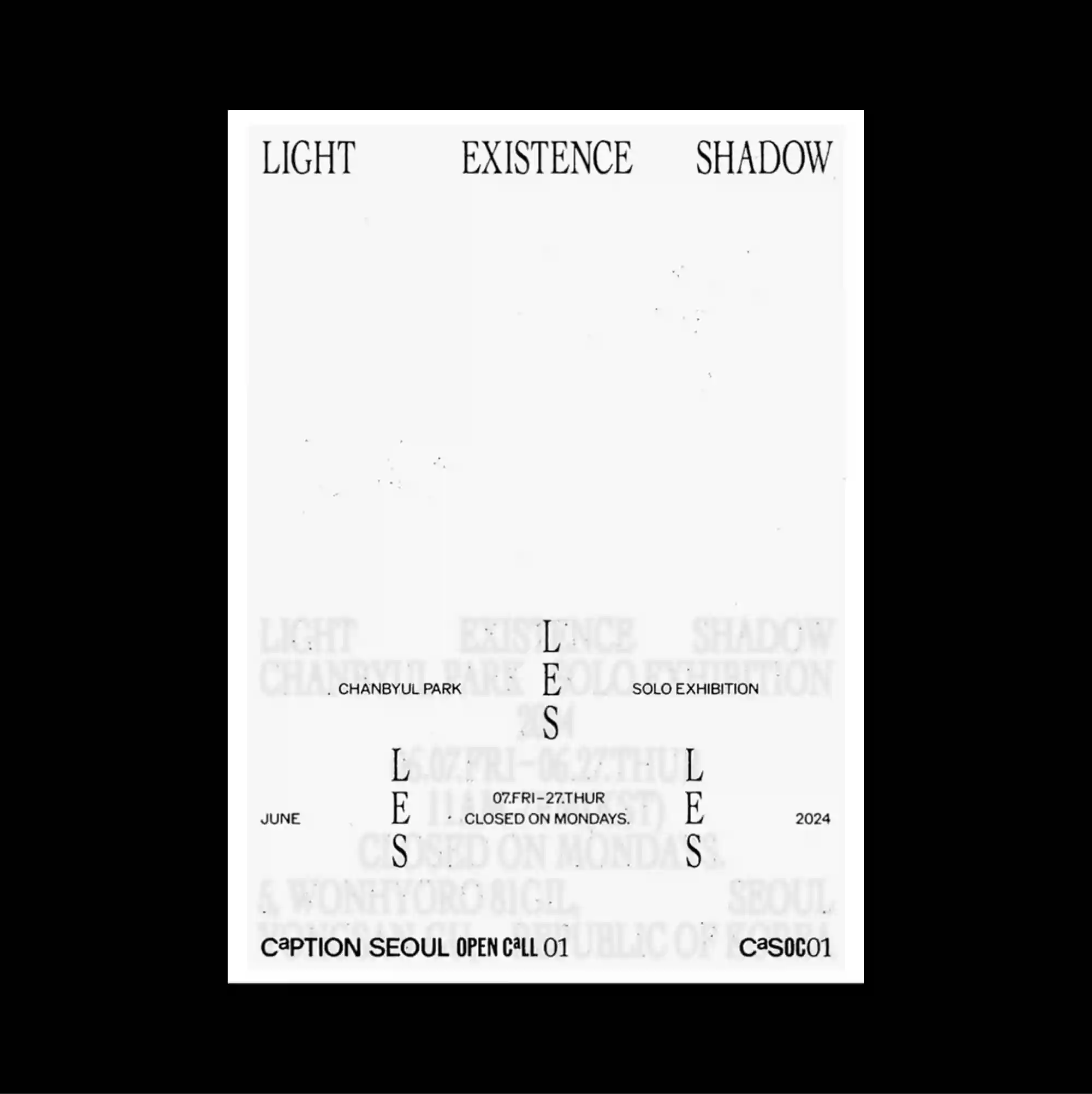
The layout is deliberately sparse, placing only a few compact elements across a broad open field so that distance and scale become active parts of the composition. Restrained serif typography is used at a relatively small scale, allowing generous spacing and subtle alignment shifts to define the hierarchy. Small words are spaced widely across the top and lower margins, with a restrained central letterform and faint repeated terms barely visible through the open white field. Generous empty space and restrained detail create a quiet composition in which small shifts of placement become visually significant.
의도적으로 비어 있는 레이아웃 안에 소수의 작은 요소만 넓게 떨어뜨려 배치하며 거리와 크기 자체가 구성 요소로 작동함. 절제된 세리프 타이포그래피를 비교적 작은 크기로 사용하며 넉넉한 간격과 미세한 정렬 변화로 위계를 구분함. 작은 단어가 상단과 하단 가장자리에 넓게 떨어져 배치되고 절제된 중앙 글자와 희미하게 반복되는 단어가 넓은 흰 영역에 거의 보이지 않게 남아 있음. 넓은 여백과 절제된 디테일 덕분에 작은 위치 변화까지 중요하게 느껴지는 조용한 구성이 형성됨.
版面刻意保持疏朗,仅将少量紧凑元素分散在大面积开放空间中,使距离与尺度本身成为构图的一部分。 克制的衬线字体以较小尺度出现,通过宽松间距与细微对齐变化建立层级。 小型词语在上下边缘大幅分散,克制的中央字形与淡淡重复文字几乎隐入宽阔白色区域。 大量留白与克制细节营造安静构图,使细微的位置变化也具有明显视觉意义。