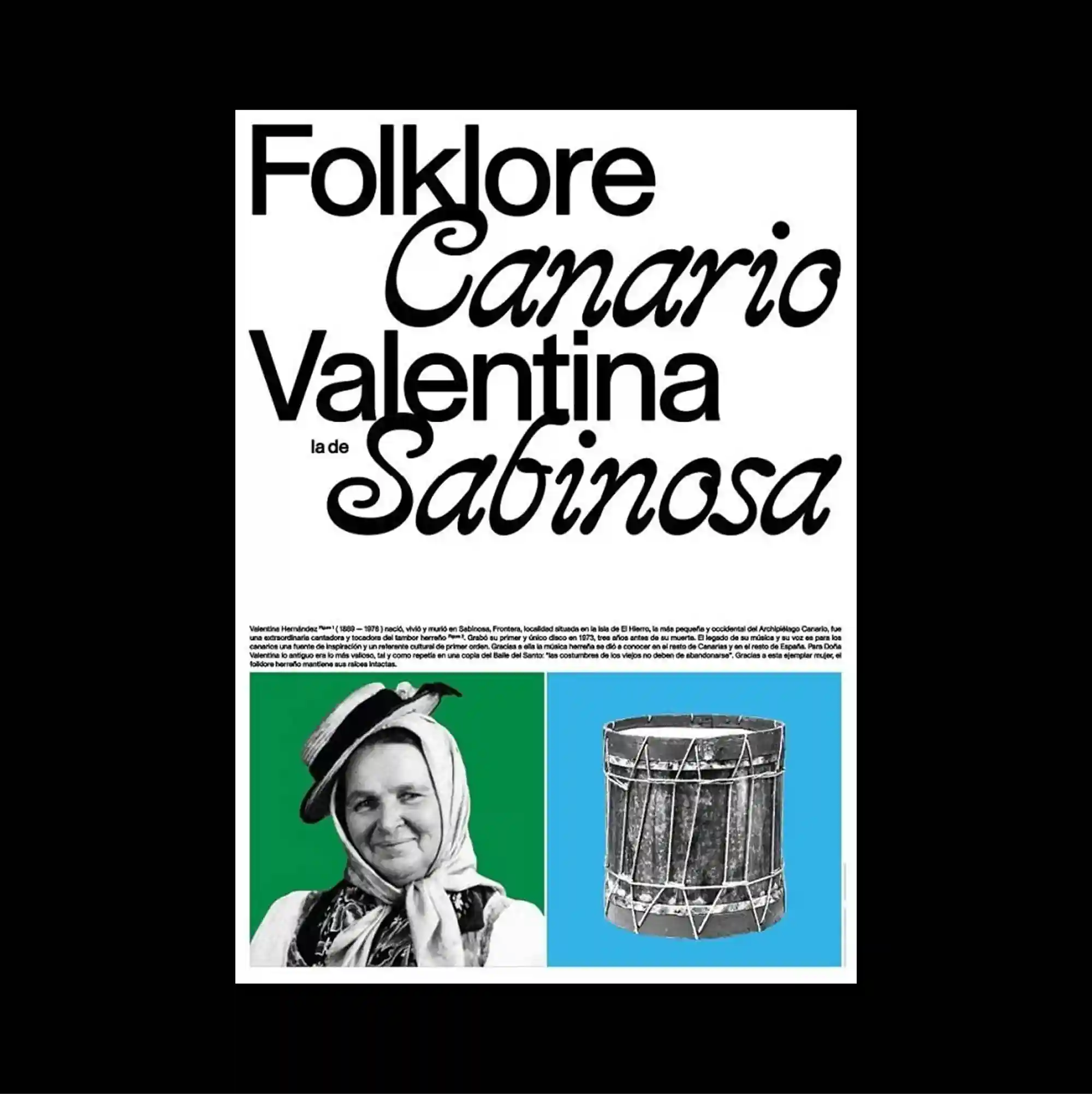
The poster separates a compact image band from a larger lower field, creating a two-part structure with a pronounced shift in density between the sections. Serif and sans-serif styles are mixed with thin rules and compact captions, producing a layered hierarchy through changes in weight, width, and alignment. Large mixed serif and script words occupy the upper two-thirds, while a green-and-cyan image strip at the bottom combines a portrait and a cylindrical object in two distinct blocks. The careful sequencing of headings, captions, and images gives the piece the discipline of a publication page while retaining the impact of a poster.
작은 이미지 띠와 더 넓은 하단 영역을 분리해 두 부분의 밀도가 뚜렷하게 달라지는 이중 구조를 형성함. 세리프와 산세리프 서체를 얇은 선과 작은 캡션과 함께 혼합해 굵기, 폭, 정렬의 변화로 다층적인 위계를 형성함. 큰 세리프와 필기체 단어가 상단 약 3분의 2를 차지하고 하단의 녹색·청록 이미지 띠에는 인물과 원통형 오브젝트가 두 블록으로 배치됨. 제목, 캡션, 이미지의 세심한 순서가 출판 페이지의 규율을 만들면서도 포스터 특유의 시각적 충격을 유지함.
海报将紧凑的图像带与更大的下方区域分开,形成上下两部分密度明显不同的结构。 衬线体与无衬线体结合细线和小型说明文字,通过字重、宽度与对齐方式的变化建立多层级关系。 大型衬线与手写体词语占据上方约三分之二,下方绿青色图像带则以两个区块并置人物与圆柱形物体。 标题、说明与图像的精心编排赋予作品出版页面般的秩序,同时保留海报的视觉冲击力。