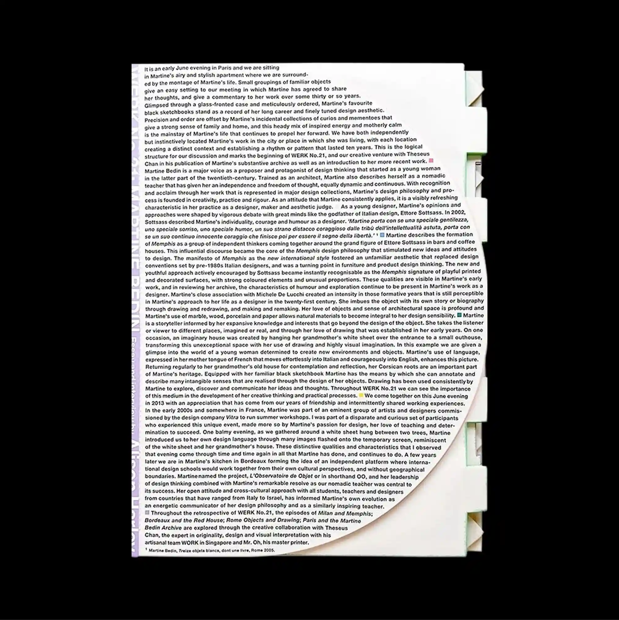
The entire surface is treated as a dense information field, with numerous small units packed closely enough to form an almost continuous visual texture. Narrow columns of small sans-serif type establish a controlled rhythm, while occasional larger words interrupt the grid and create focal points. Dense paragraph text fills almost the entire sheet, interrupted only by rough torn edges, pale layered paper corners, and a subtle circular fold-like form near the lower area. The controlled alignment and rough material details give the poster a direct archival print character while keeping the visual rhythm sharply organized.
수많은 작은 단위를 촘촘하게 배치해 페이지 전체가 거의 연속적인 시각 질감처럼 읽히는 고밀도 정보 영역으로 구성됨. 작은 산세리프 텍스트를 좁은 열로 정렬해 통제된 리듬을 만들고, 간헐적으로 등장하는 큰 글자가 그리드를 끊으며 초점을 형성함. 조밀한 문단 텍스트가 페이지 거의 전체를 채우고 거친 찢김 가장자리, 겹쳐진 밝은 종이 모서리, 하단의 은은한 원형 접힘 형태만 이를 끊음. 통제된 정렬과 거친 물성 디테일이 직접적인 아카이브 인쇄물의 성격을 만들면서도 시각적 리듬은 선명하게 유지함.
整个表面被处理成高密度的信息场,大量微小单元紧密排列,几乎形成连续的视觉纹理。 小号无衬线文字以窄栏排列形成克制节奏,偶尔出现的大字号词语打断网格并形成视觉焦点。 密集段落文字几乎铺满整张页面,仅被粗糙撕裂边缘、浅色叠纸角与下部淡淡圆形折痕打断。 受控的对齐方式与粗粝材质细节赋予海报直接的档案印刷感,同时保持清晰有序的视觉节奏。