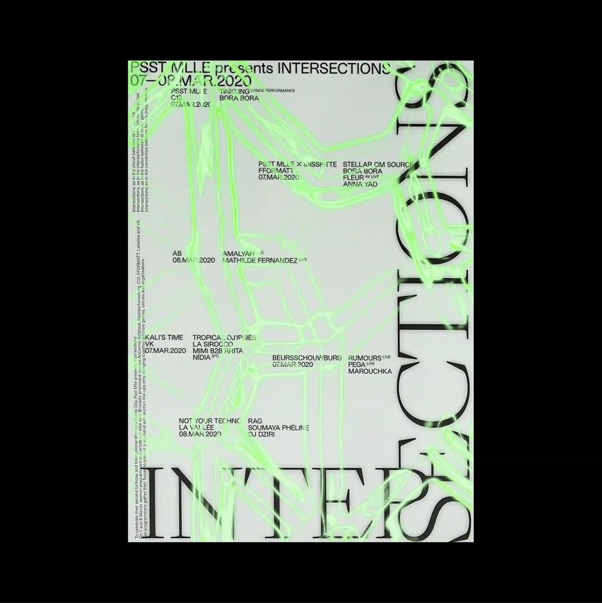
An asymmetrical arrangement is anchored by one oversized geometric or typographic form, while smaller supporting elements are pushed toward the edges. Thin outlined lettering and delicate strokes keep the typography visually light, even when the letterforms extend to a large scale. Pale green contour lines and small coordinate-like labels spread across the sheet, while huge outlined letters run vertically along the sides and extend beyond the frame. The result feels analytical and technical, using repetition and precise spacing to turn information into a structured visual system.
하나의 초대형 기하 또는 타이포그래피 형태를 비대칭 구성의 중심축으로 두고, 작은 보조 요소들은 가장자리로 밀어 배치함. 얇은 외곽선 글자와 섬세한 획을 사용해 문자 크기가 커져도 타이포그래피가 가볍게 보이도록 함. 연한 녹색 등고선형 선과 작은 좌표형 라벨이 화면에 퍼지고, 거대한 외곽선 글자가 측면을 따라 세로로 이어지며 프레임 밖으로 잘려 나감. 반복과 정밀한 간격을 통해 정보를 구조화된 시각 시스템으로 전환하며 분석적이고 기술적인 인상을 형성함.
不对称构图由一个超大的几何或文字形态作为锚点,较小的辅助元素则被推向页面边缘。 纤细的描边字形与轻薄笔画使文字即使放大后仍保持轻盈的视觉感受。 浅绿色等高线式线条与小型坐标标签铺满页面,巨大的描边字形沿两侧纵向延伸并被边缘裁切。 通过重复与精确间距将信息转化为结构化视觉系统,整体呈现分析性与技术感。