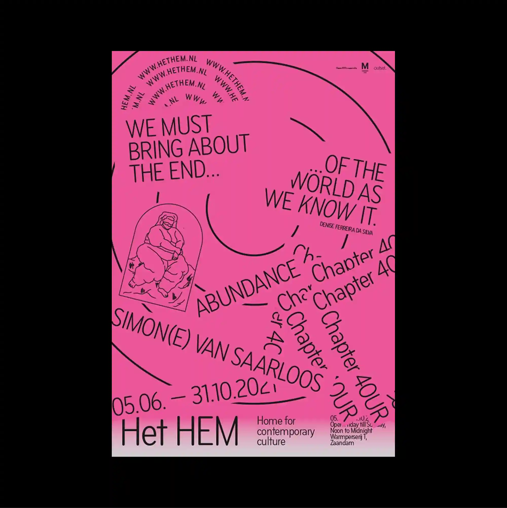
An asymmetrical arrangement is anchored by one oversized geometric or typographic form, while smaller supporting elements are pushed toward the edges. Different scripts, orientations, and typographic weights are mixed freely, producing a layered reading experience with no single dominant direction. A saturated pink field is crossed by long curved lines, angled phrases, a small outlined figure, and repeated chapter-like text that bends around the open center. Unexpected alignments, playful shapes, and uneven spacing create a deliberately irregular rhythm that keeps the surface visually active.
하나의 초대형 기하 또는 타이포그래피 형태를 비대칭 구성의 중심축으로 두고, 작은 보조 요소들은 가장자리로 밀어 배치함. 서로 다른 문자 체계와 방향, 굵기를 자유롭게 혼합해 하나의 지배적인 읽기 방향이 없는 다층적 읽기 경험을 형성함. 강한 분홍색 면 위로 긴 곡선, 기울어진 문구, 작은 외곽선 인물, 반복되는 장형 텍스트가 넓은 중앙을 감싸듯 배치됨. 예상 밖의 정렬, 장난스러운 형태, 불균일한 간격이 의도적으로 불규칙한 리듬을 만들며 화면을 지속적으로 활성화함.
不对称构图由一个超大的几何或文字形态作为锚点,较小的辅助元素则被推向页面边缘。 不同文字体系、方向与字重被自由混合,形成没有单一主导方向的多层阅读体验。 高饱和粉色区域被长曲线、倾斜文字、小型描边人物与重复章节式文字穿过,并围绕开阔中心展开。 出乎意料的对齐、活泼形态与不均匀间距构成刻意不规则的节奏,使表面始终保持活跃。