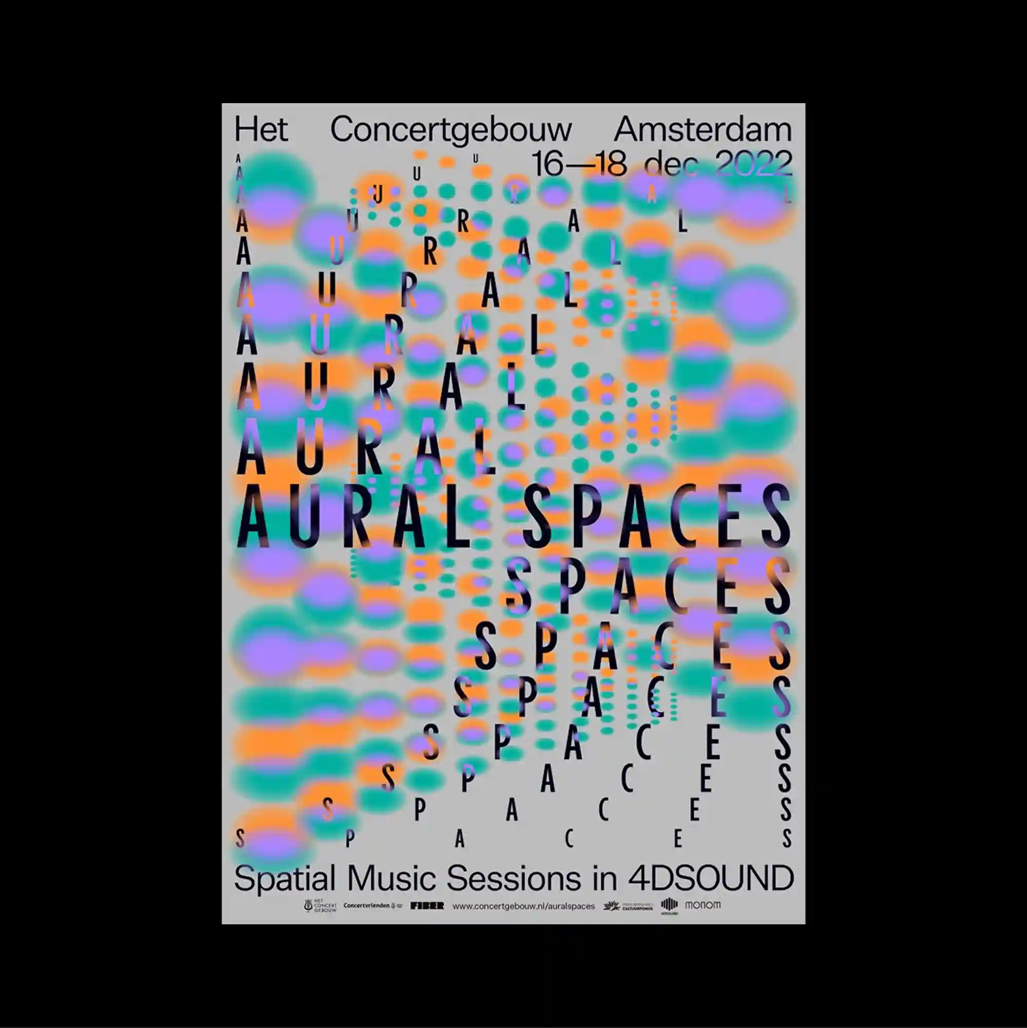
The entire surface is treated as a dense information field, with numerous small units packed closely enough to form an almost continuous visual texture. Heavy black display type creates the main visual anchors, with smaller text fitted into the remaining gaps and margins. Soft multicolored blurred shapes repeat behind tall black lettering, creating a dense field where the text remains legible through strong contrast and vertical alignment. Bold color contrasts and abrupt shifts in scale produce an energetic graphic rhythm that remains legible despite the density of the elements.
수많은 작은 단위를 촘촘하게 배치해 페이지 전체가 거의 연속적인 시각 질감처럼 읽히는 고밀도 정보 영역으로 구성됨. 굵은 검정 디스플레이 타이포그래피가 주요 시각 축을 만들고, 작은 텍스트가 그 사이의 빈틈과 여백에 들어가도록 구성함. 부드럽게 흐려진 다색 형태가 큰 검정 글자 뒤에서 반복되어 조밀한 화면을 만들고, 강한 대비와 세로 정렬 덕분에 텍스트의 읽힘이 유지됨. 강한 색 대비와 갑작스러운 크기 변화가 요소가 많아도 읽힘을 유지하는 활기찬 그래픽 리듬을 만들어냄.
整个表面被处理成高密度的信息场,大量微小单元紧密排列,几乎形成连续的视觉纹理。 厚重的黑色展示字体形成主要视觉锚点,较小文字则填入剩余空隙与边缘。 柔和的多彩模糊形态在高大黑色文字后方重复,形成密集场域,并依靠强烈对比与纵向对齐保持可读性。 强烈色彩对比与突变的尺度形成充满能量的图形节奏,即使元素密集仍保持清晰可读。