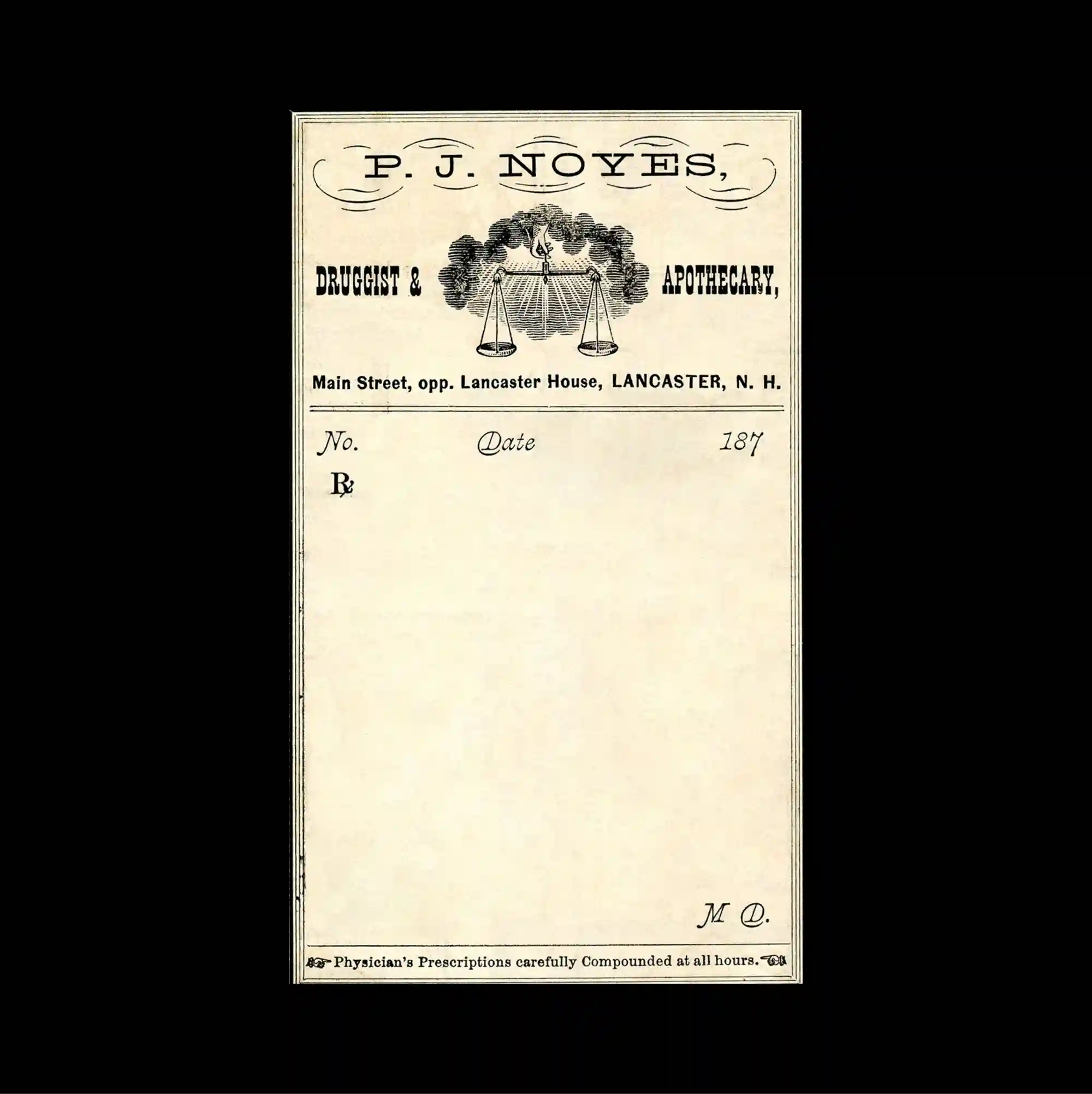
A centered composition leaves a substantial amount of open space around the main elements, allowing a small cluster of imagery and type to carry most of the visual weight. Restrained serif typography is used at a relatively small scale, allowing generous spacing and subtle alignment shifts to define the hierarchy. The design resembles a vintage form, using an ornate engraved header, thin horizontal writing lines, and a large untouched central area with softly aged paper texture. The controlled alignment and rough material details give the poster a direct archival print character while keeping the visual rhythm sharply organized.
주요 요소 주변에 넓은 여백을 남긴 중앙 집중형 구성으로, 작은 이미지와 타이포그래피 묶음이 화면의 대부분의 시각적 무게를 담당함. 절제된 세리프 타이포그래피를 비교적 작은 크기로 사용하며 넉넉한 간격과 미세한 정렬 변화로 위계를 구분함. 장식적인 판화형 헤더와 얇은 가로 작성선, 넓게 비워진 중앙 영역을 사용해 오래된 종이 질감의 빈티지 서식처럼 구성됨. 통제된 정렬과 거친 물성 디테일이 직접적인 아카이브 인쇄물의 성격을 만들면서도 시각적 리듬은 선명하게 유지함.
居中的构图在主要元素周围保留大量留白,使少量图像与文字组合承担页面大部分视觉重量。 克制的衬线字体以较小尺度出现,通过宽松间距与细微对齐变化建立层级。 设计类似复古表格,以装饰性雕版标题、细横线书写区与大面积空白中央构成,并保留柔和的旧纸质感。 受控的对齐方式与粗粝材质细节赋予海报直接的档案印刷感,同时保持清晰有序的视觉节奏。