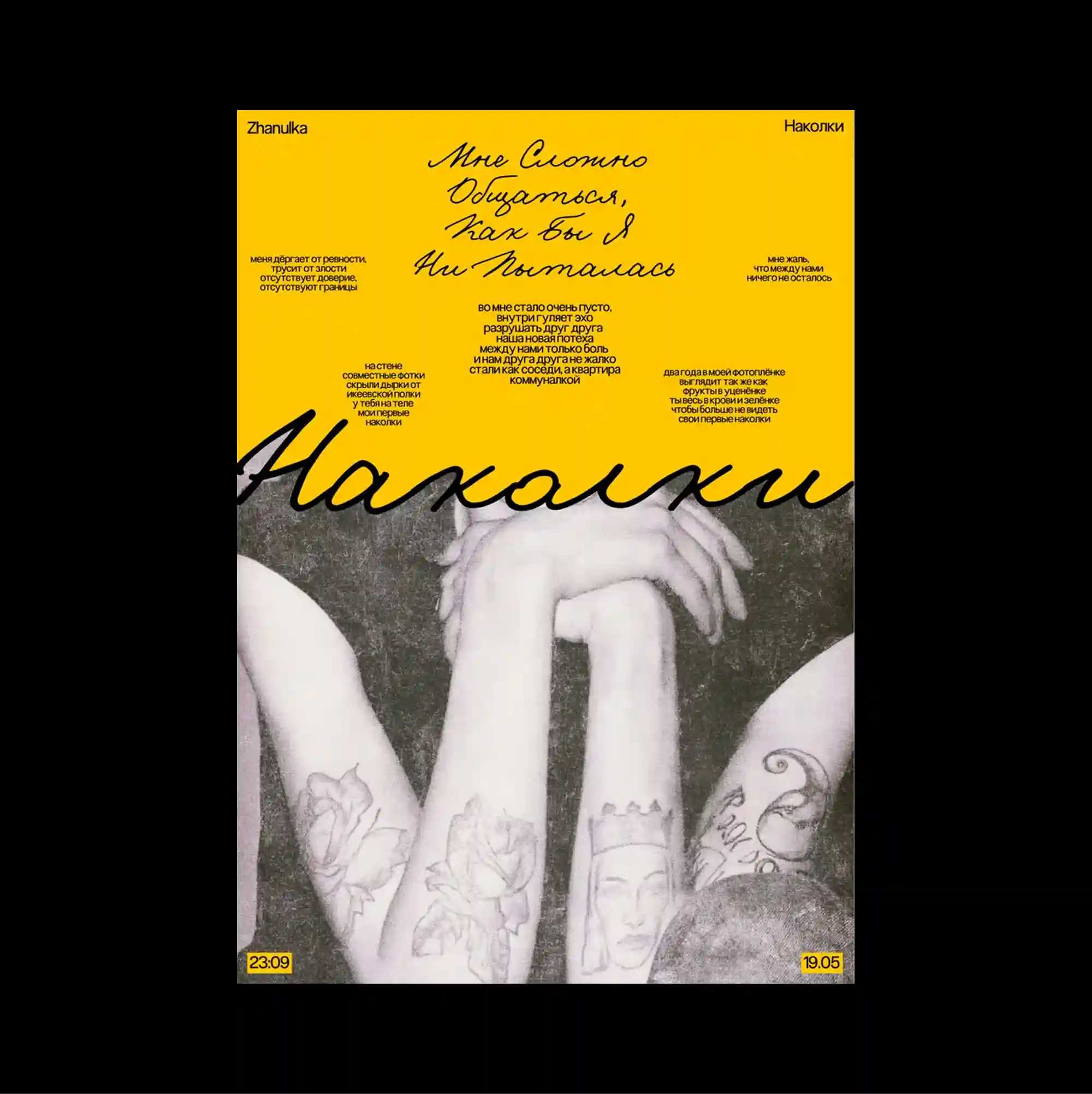
The design is divided into strongly contrasting color and image zones, using large rectangular fields to establish a clear structural hierarchy. Handwritten marks and informal annotations are layered over more systematic printed type, creating tension between spontaneous gestures and controlled typography. A mustard-colored upper field holds compact text and sweeping script, while the lower half is dominated by a grayscale crop of tattooed arms and hands. Bold color contrasts and abrupt shifts in scale produce an energetic graphic rhythm that remains legible despite the density of the elements.
큰 직사각형 색면과 이미지 영역을 강하게 대비시켜 분할하고, 이를 통해 명확한 구조적 위계를 형성함. 손글씨 흔적과 비정형 주석을 체계적인 인쇄 타이포그래피 위에 겹쳐 즉흥적인 제스처와 통제된 문자 사이의 긴장을 만듦. 머스터드색 상단 영역에는 작은 텍스트와 크게 휘어진 필기체가 놓이고, 하단 절반은 문신이 있는 팔과 손의 흑백 크롭 이미지가 지배함. 강한 색 대비와 갑작스러운 크기 변화가 요소가 많아도 읽힘을 유지하는 활기찬 그래픽 리듬을 만들어냄.
设计以强烈对比的色块与图像区域进行分割,并利用大面积矩形建立清晰的结构层级。 手写痕迹与随性注记叠加在系统化印刷字体之上,使即兴笔触与受控文字之间形成张力。 芥末黄色上部区域放置紧凑文字与大幅弧形手写体,下半部则由纹身手臂与手部的灰度裁切图像主导。 强烈色彩对比与突变的尺度形成充满能量的图形节奏,即使元素密集仍保持清晰可读。