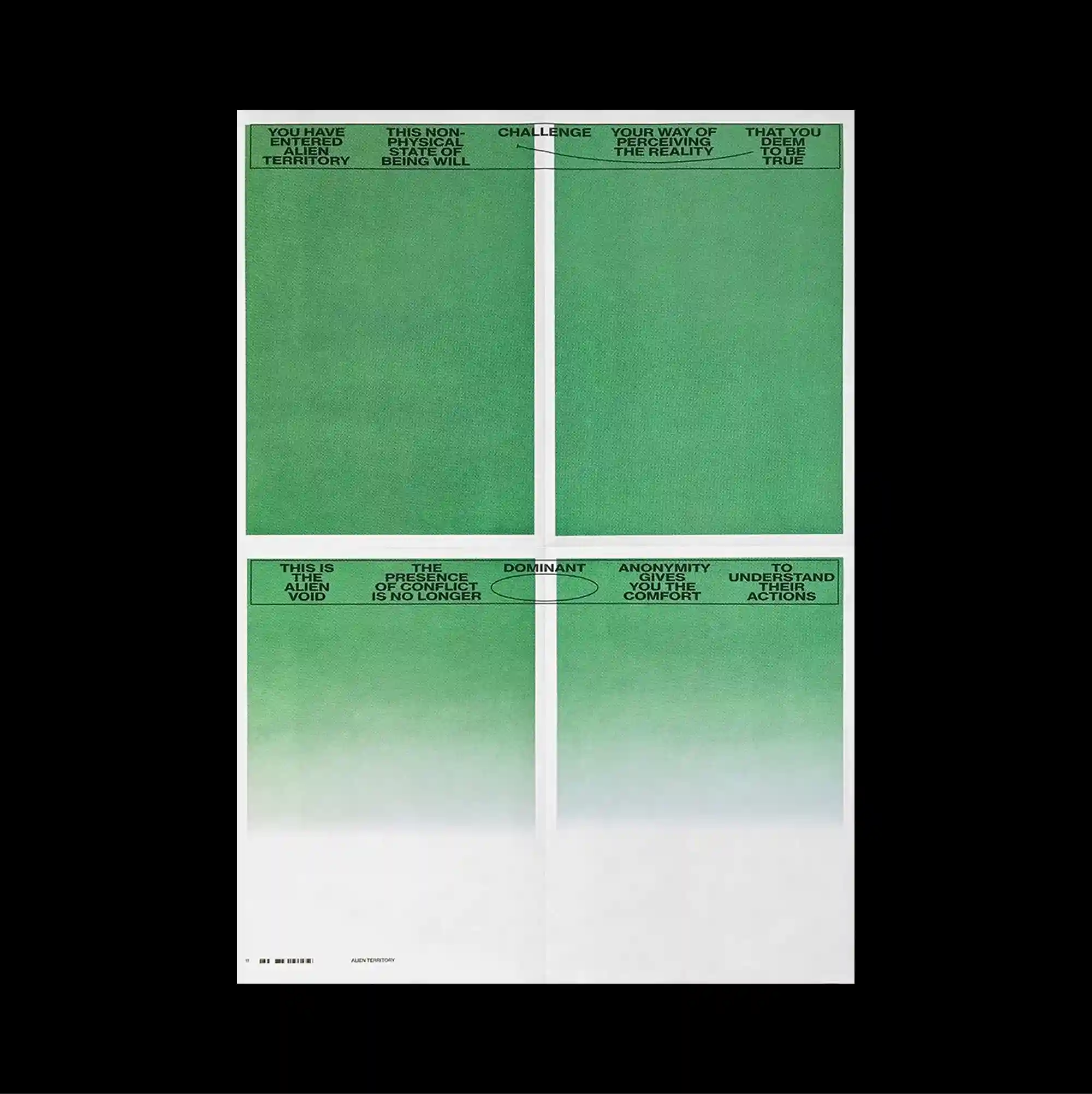
The surface is built from stacked rectangular panels of different sizes, producing a clear vertical rhythm through repeated blocks and abrupt transitions. Narrow columns of small sans-serif type establish a controlled rhythm, while occasional larger words interrupt the grid and create focal points. Four green gradient panels are divided by a white cross, with tiny repeated type concentrated along the upper and central edges of each section. Precise alignment and dense secondary information give the design a highly functional appearance while preserving a distinctive graphic hierarchy.
서로 다른 크기의 직사각형 패널을 위아래로 쌓아 반복되는 블록과 급격한 전환으로 뚜렷한 세로 리듬을 형성함. 작은 산세리프 텍스트를 좁은 열로 정렬해 통제된 리듬을 만들고, 간헐적으로 등장하는 큰 글자가 그리드를 끊으며 초점을 형성함. 네 개의 녹색 그라데이션 패널이 흰 십자선으로 나뉘고 작은 반복 타이포그래피가 각 영역의 상단과 중앙 가장자리에 집중됨. 정밀한 정렬과 조밀한 보조 정보가 기능적인 인상을 강화하면서도 뚜렷한 그래픽 위계를 유지함.
画面由不同尺寸的矩形面板上下堆叠而成,通过重复区块与突然的转换形成清晰的纵向节奏。 小号无衬线文字以窄栏排列形成克制节奏,偶尔出现的大字号词语打断网格并形成视觉焦点。 四块绿色渐变面板被白色十字分割,微小重复文字集中在各区块的顶部与中央边缘。 精确对齐与密集次级信息强化功能性外观,同时保留鲜明的图形层级。