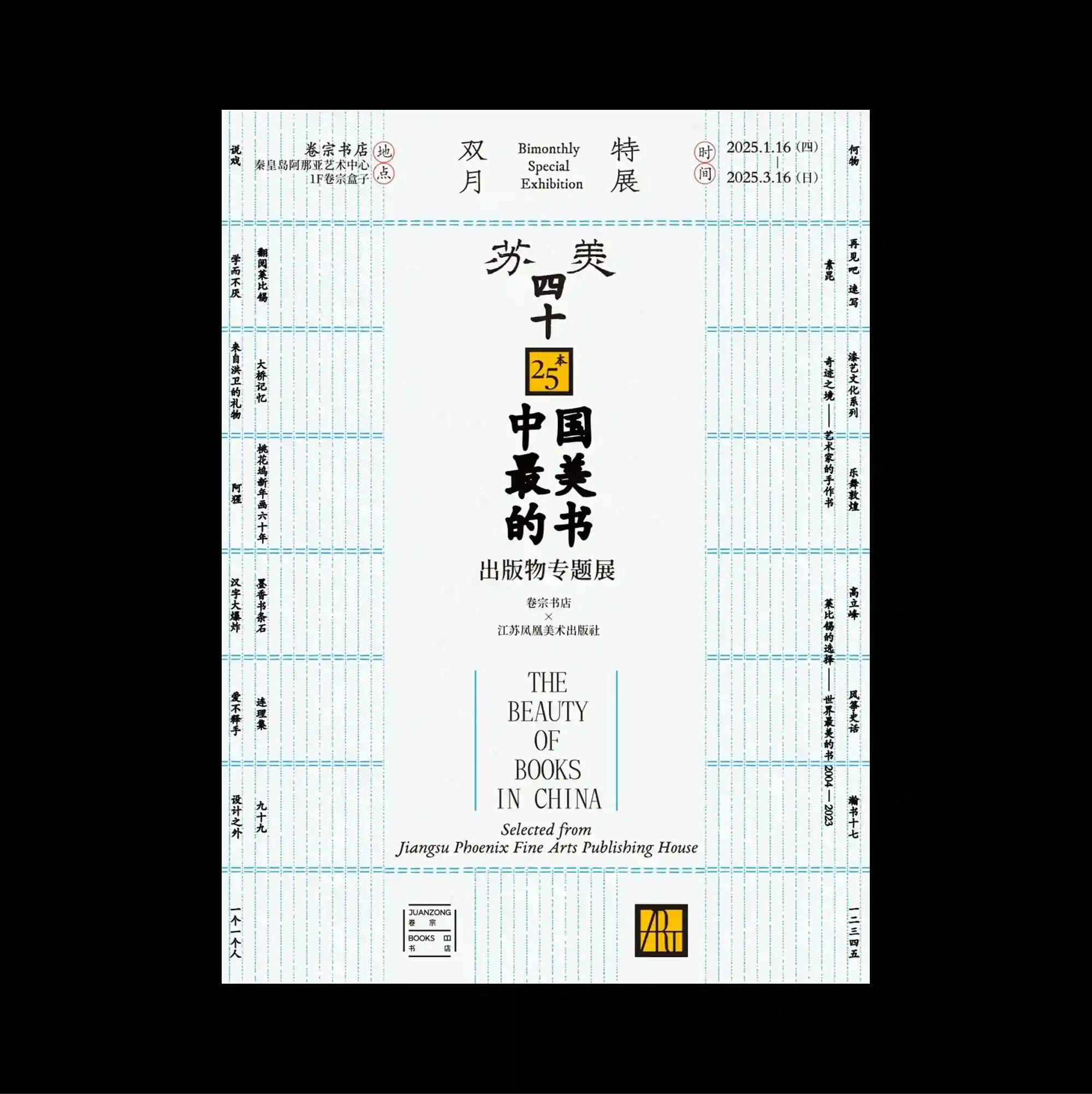
The page is organized as a sequence of modular bands and compartments, each functioning like a small technical panel within a larger information system. Vertical East Asian type is combined with smaller horizontal information, creating multiple reading directions within the same tightly controlled structure. Fine blue ruled lines structure the sheet like a ledger, while tall black Chinese characters, narrow side columns, and small registration marks create a formal publication-like framework. The careful sequencing of headings, captions, and images gives the piece the discipline of a publication page while retaining the impact of a poster.
페이지를 여러 개의 모듈형 띠와 구획으로 나누고 각 영역이 더 큰 정보 시스템 안의 작은 기술 패널처럼 작동하도록 구성함. 세로 방향의 동아시아 문자와 작은 가로 정보를 결합해 하나의 통제된 구조 안에 여러 읽기 방향을 동시에 형성함. 가는 파란 줄이 장부처럼 화면을 구조화하고, 세로로 긴 검정 중국어 글자와 좁은 측면 열, 작은 등록 표식이 정제된 출판물형 프레임을 만듦. 제목, 캡션, 이미지의 세심한 순서가 출판 페이지의 규율을 만들면서도 포스터 특유의 시각적 충격을 유지함.
页面被组织成连续的模块化横带与分区,每个区域都像更大信息系统中的独立技术面板。 竖排东亚文字与较小的横向信息结合,在同一严谨结构中形成多重阅读方向。 细密蓝色横线像账册一样组织页面,高瘦黑色中文字符、狭窄侧栏与小型定位标记共同形成正式出版物式框架。 标题、说明与图像的精心编排赋予作品出版页面般的秩序,同时保留海报的视觉冲击力。