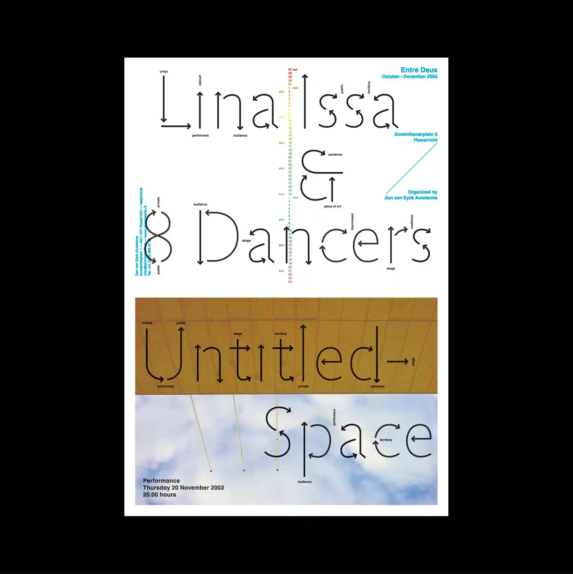
The surface is built from stacked rectangular panels of different sizes, producing a clear vertical rhythm through repeated blocks and abrupt transitions. Thin outlined lettering and delicate strokes keep the typography visually light, even when the letterforms extend to a large scale. Thin elongated letterforms stretch vertically across several horizontal bands, mixing pale blue imagery, a warm ochre rectangle, and small calibration-like marks. Strong scale contrast and simplified spatial relationships make the composition immediately readable while preserving a distinctive experimental edge.
서로 다른 크기의 직사각형 패널을 위아래로 쌓아 반복되는 블록과 급격한 전환으로 뚜렷한 세로 리듬을 형성함. 얇은 외곽선 글자와 섬세한 획을 사용해 문자 크기가 커져도 타이포그래피가 가볍게 보이도록 함. 얇고 길게 늘어난 글자 형태가 여러 가로 띠를 세로로 관통하며 연한 파란 이미지, 따뜻한 황토색 사각형, 작은 교정 표식을 혼합함. 강한 크기 대비와 단순화된 공간 관계 덕분에 즉각적으로 읽히면서도 독특한 실험적 성격을 유지함.
画面由不同尺寸的矩形面板上下堆叠而成,通过重复区块与突然的转换形成清晰的纵向节奏。 纤细的描边字形与轻薄笔画使文字即使放大后仍保持轻盈的视觉感受。 纤细拉长的字形纵向贯穿多条横带,并混合浅蓝影像、暖赭色矩形与微小校准式标记。 强烈尺度反差与简化的空间关系使构图能够被迅速识别,同时保留鲜明的实验性。