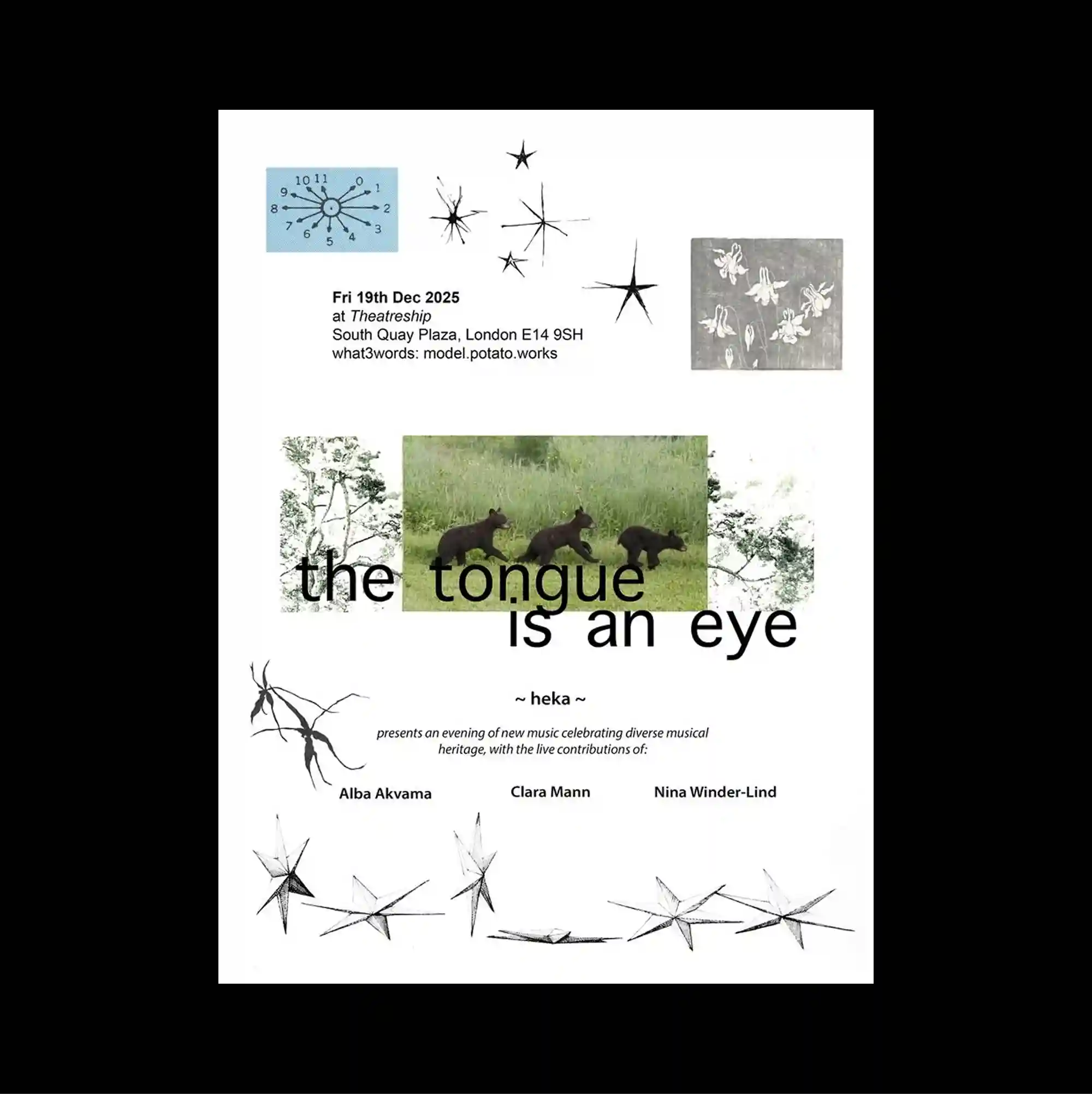
Several overlapping panels and cropped fragments are layered across the page, creating an assembled composition in which foreground and background continuously exchange roles. Thin outlined lettering and delicate strokes keep the typography visually light, even when the letterforms extend to a large scale. Plant and landscape fragments are combined with small star-like drawings, thin branching lines, and a central title that cuts across a strip of green imagery. Unexpected alignments, playful shapes, and uneven spacing create a deliberately irregular rhythm that keeps the surface visually active.
여러 패널과 잘린 조각을 겹겹이 중첩해 전경과 후경의 관계가 계속 뒤바뀌는 조립식 구성을 형성함. 얇은 외곽선 글자와 섬세한 획을 사용해 문자 크기가 커져도 타이포그래피가 가볍게 보이도록 함. 식물과 풍경 조각이 작은 별 모양 드로잉, 가는 가지형 선과 결합되고 중앙 제목이 녹색 이미지 띠를 가로지름. 예상 밖의 정렬, 장난스러운 형태, 불균일한 간격이 의도적으로 불규칙한 리듬을 만들며 화면을 지속적으로 활성화함.
多个面板与裁切碎片层层叠置,使前景与后景不断交换角色,形成组装感强烈的构图。 纤细的描边字形与轻薄笔画使文字即使放大后仍保持轻盈的视觉感受。 植物与景观碎片结合星形小图、细长分叉线条,中央标题横跨一条绿色影像带。 出乎意料的对齐、活泼形态与不均匀间距构成刻意不规则的节奏,使表面始终保持活跃。