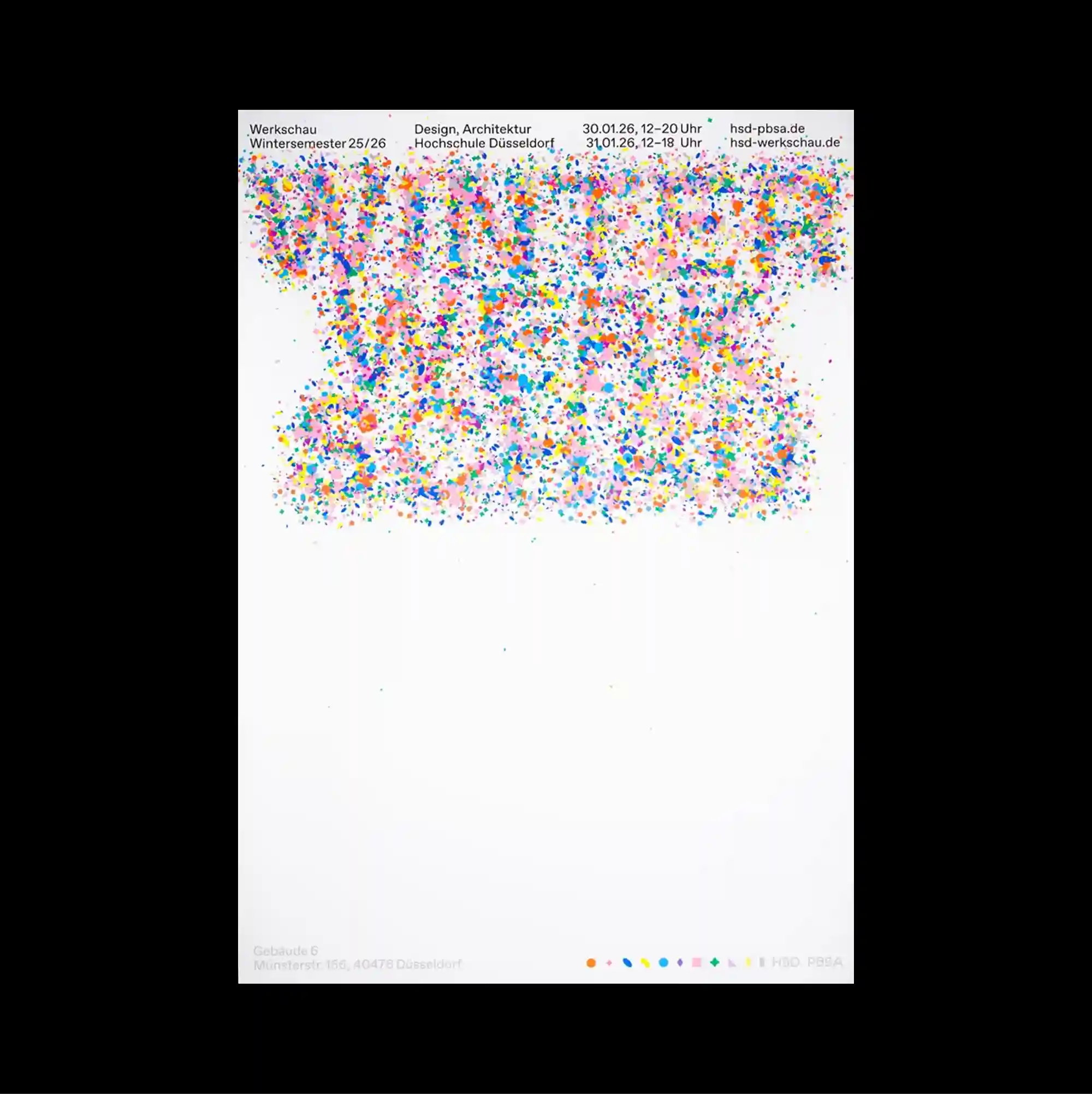
The poster separates a compact image band from a larger lower field, creating a two-part structure with a pronounced shift in density between the sections. Narrow columns of small sans-serif type establish a controlled rhythm, while occasional larger words interrupt the grid and create focal points. A dense cloud of tiny multicolored marks fills the upper region beneath a narrow information header, while the lower half remains largely empty except for minimal indexing details. The repeated structures make the poster read like a diagram or index, with visual meaning emerging from accumulation rather than a single focal image.
작은 이미지 띠와 더 넓은 하단 영역을 분리해 두 부분의 밀도가 뚜렷하게 달라지는 이중 구조를 형성함. 작은 산세리프 텍스트를 좁은 열로 정렬해 통제된 리듬을 만들고, 간헐적으로 등장하는 큰 글자가 그리드를 끊으며 초점을 형성함. 좁은 정보 헤더 아래 상단 영역을 작은 다색 표식이 구름처럼 가득 채우고, 하단 절반은 최소한의 인덱스 정보만 남긴 채 대부분 비워짐. 반복 구조가 포스터를 다이어그램이나 인덱스처럼 보이게 하며 단일 초점 이미지보다 요소의 축적에서 시각적 의미가 형성됨.
海报将紧凑的图像带与更大的下方区域分开,形成上下两部分密度明显不同的结构。 小号无衬线文字以窄栏排列形成克制节奏,偶尔出现的大字号词语打断网格并形成视觉焦点。 窄窄的信息标题下方,上部被大量微小多彩标记如云般填满,而下半部除少量索引细节外基本留空。 重复结构使海报呈现图解或索引般的特征,视觉意义更多来自元素累积而非单一焦点图像。