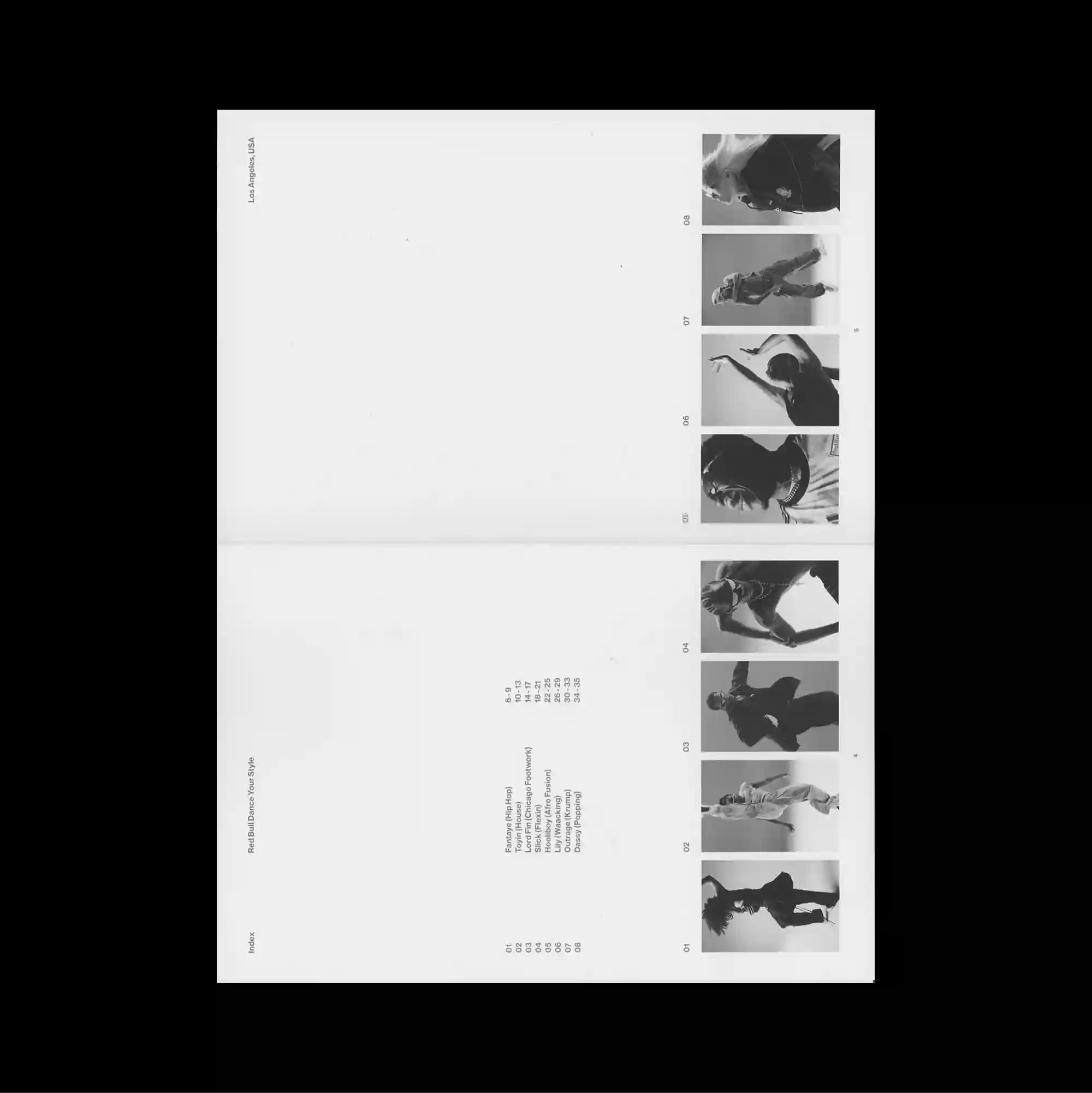
The layout is deliberately sparse, placing only a few compact elements across a broad open field so that distance and scale become active parts of the composition. Restrained serif typography is used at a relatively small scale, allowing generous spacing and subtle alignment shifts to define the hierarchy. A narrow column of monochrome film stills runs down the far right, while tiny centered text and faint fold-like divisions leave most of the sheet visually untouched. The contrast between image fragments and restrained type creates a cinematic pacing, with the eye moving between isolated moments rather than a continuous field.
의도적으로 비어 있는 레이아웃 안에 소수의 작은 요소만 넓게 떨어뜨려 배치하며 거리와 크기 자체가 구성 요소로 작동함. 절제된 세리프 타이포그래피를 비교적 작은 크기로 사용하며 넉넉한 간격과 미세한 정렬 변화로 위계를 구분함. 좁은 흑백 영화 스틸 열이 가장 오른쪽을 따라 이어지고 작은 중앙 텍스트와 희미한 접힘선 같은 구획만 남아 페이지 대부분이 비어 보임. 이미지 조각과 절제된 타이포그래피의 대비가 영화적인 호흡을 만들며 시선이 연속된 면보다 분리된 순간들 사이를 이동하게 함.
版面刻意保持疏朗,仅将少量紧凑元素分散在大面积开放空间中,使距离与尺度本身成为构图的一部分。 克制的衬线字体以较小尺度出现,通过宽松间距与细微对齐变化建立层级。 一列狭窄黑白电影剧照沿最右侧向下排列,中央只有微小文字与淡淡的折线式分区,使大部分页面保持空白。 影像碎片与克制文字之间的对比形成电影式节奏,使视线在彼此分离的瞬间之间移动,而非停留于连续表面。