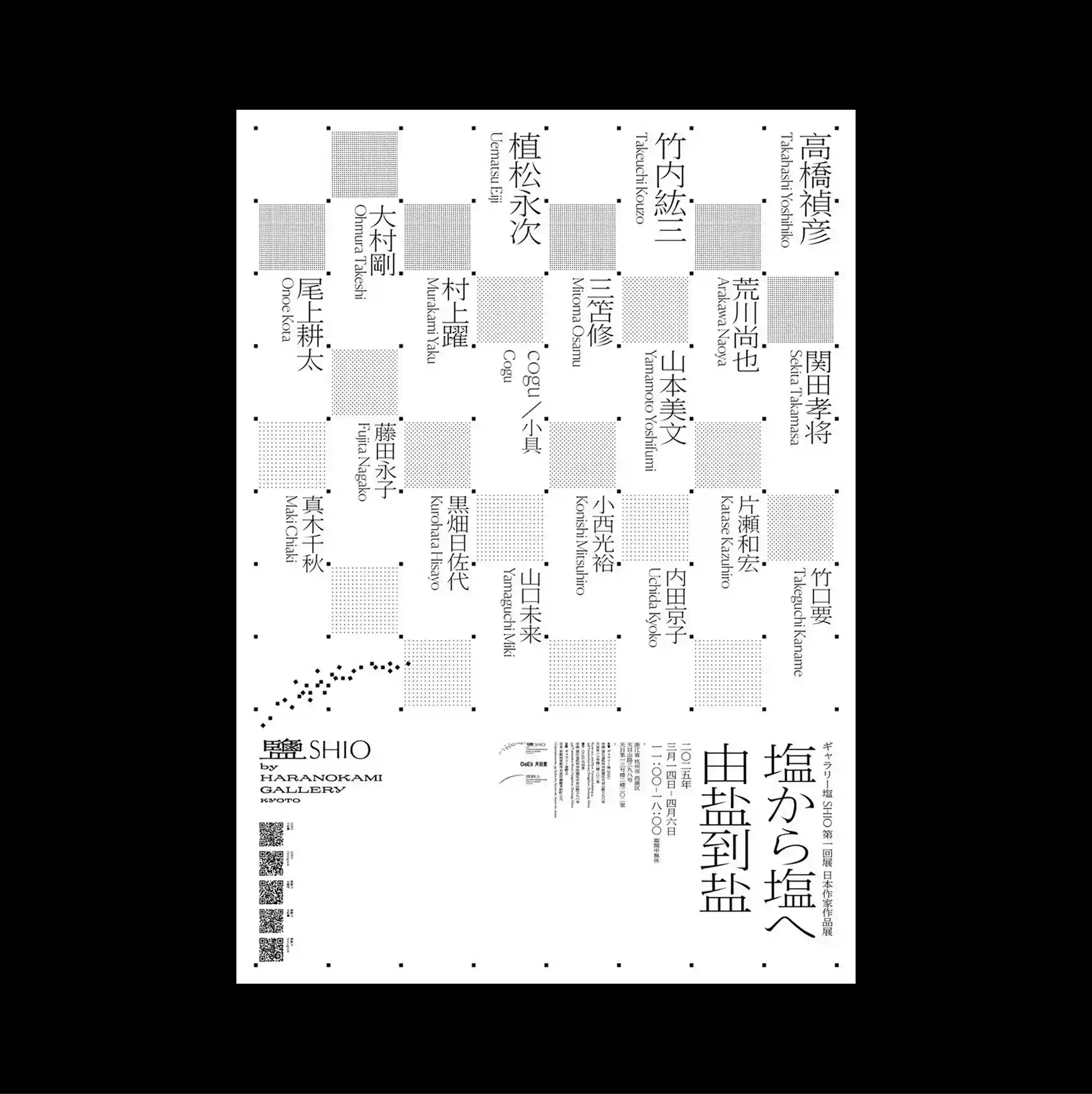
The entire surface is treated as a dense information field, with numerous small units packed closely enough to form an almost continuous visual texture. Vertical East Asian type is combined with smaller horizontal information, creating multiple reading directions within the same tightly controlled structure. Alternating gray squares and vertical East Asian text form a loose checkerboard, with small rules and captions distributed through the gaps like a modular index. Precise alignment and dense secondary information give the design a highly functional appearance while preserving a distinctive graphic hierarchy.
수많은 작은 단위를 촘촘하게 배치해 페이지 전체가 거의 연속적인 시각 질감처럼 읽히는 고밀도 정보 영역으로 구성됨. 세로 방향의 동아시아 문자와 작은 가로 정보를 결합해 하나의 통제된 구조 안에 여러 읽기 방향을 동시에 형성함. 회색 사각형과 세로 방향의 동아시아 문자가 느슨한 체커보드를 만들고 작은 선과 캡션이 빈틈에 분산되어 모듈형 인덱스처럼 보임. 정밀한 정렬과 조밀한 보조 정보가 기능적인 인상을 강화하면서도 뚜렷한 그래픽 위계를 유지함.
整个表面被处理成高密度的信息场,大量微小单元紧密排列,几乎形成连续的视觉纹理。 竖排东亚文字与较小的横向信息结合,在同一严谨结构中形成多重阅读方向。 灰色方块与竖排东亚文字交替形成松散棋盘格,细线与小型说明分布在空隙中,呈现模块化索引感。 精确对齐与密集次级信息强化功能性外观,同时保留鲜明的图形层级。