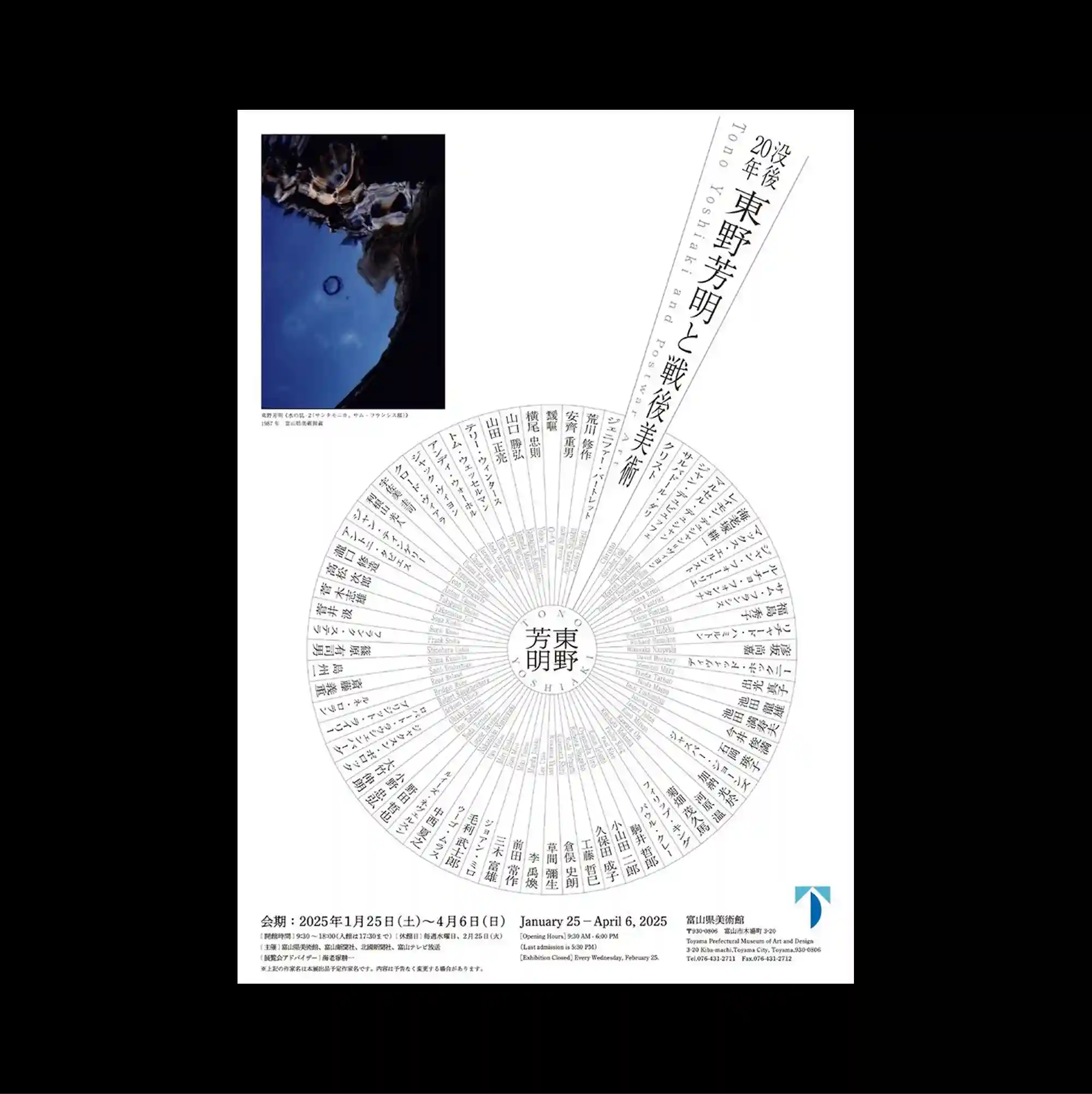
A radial structure dominates the page, arranging text and graphic marks around circular paths that pull attention toward and away from the center. Vertical East Asian type is combined with smaller horizontal information, creating multiple reading directions within the same tightly controlled structure. A large circular typographic wheel occupies the lower half, intersected by a sharply angled text band and balanced by one compact blue-toned photograph near the top. The repeated structures make the poster read like a diagram or index, with visual meaning emerging from accumulation rather than a single focal image.
원형 경로를 따라 텍스트와 그래픽 표식을 배치한 방사형 구조가 페이지를 지배하며 시선을 중심과 바깥쪽 사이로 반복 이동시킴. 세로 방향의 동아시아 문자와 작은 가로 정보를 결합해 하나의 통제된 구조 안에 여러 읽기 방향을 동시에 형성함. 큰 원형 타이포그래피 휠이 하단 절반을 차지하고 가파르게 기울어진 텍스트 띠가 이를 가로지르며 상단의 작은 푸른색 사진이 균형을 잡음. 반복 구조가 포스터를 다이어그램이나 인덱스처럼 보이게 하며 단일 초점 이미지보다 요소의 축적에서 시각적 의미가 형성됨.
放射状结构主导页面,文字与图形标记沿圆形路径排列,使视线不断在中心与外围之间往返。 竖排东亚文字与较小的横向信息结合,在同一严谨结构中形成多重阅读方向。 大型圆形文字轮盘占据下半部,一条陡斜文字带穿过其上,并由顶部一张小型蓝调照片取得平衡。 重复结构使海报呈现图解或索引般的特征,视觉意义更多来自元素累积而非单一焦点图像。