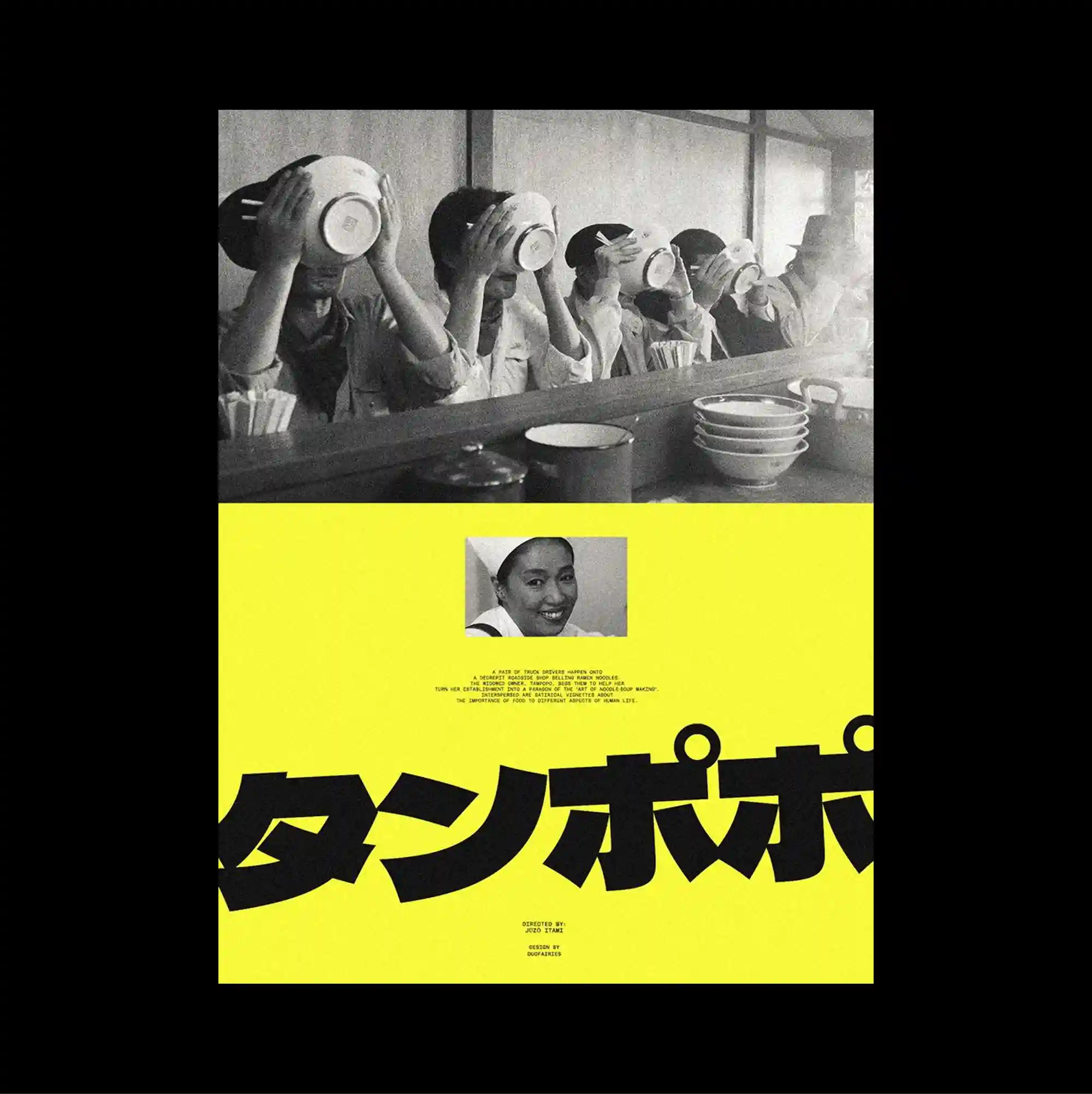
The poster separates a compact image band from a larger lower field, creating a two-part structure with a pronounced shift in density between the sections. Oversized display lettering is paired with dense micro-typography, creating an extreme scale contrast between headline forms and secondary information. A wide monochrome photograph of repeated figures occupies the upper section, while an intense yellow lower field is cut by a small portrait and oversized cropped Japanese lettering. Bold color contrasts and abrupt shifts in scale produce an energetic graphic rhythm that remains legible despite the density of the elements.
작은 이미지 띠와 더 넓은 하단 영역을 분리해 두 부분의 밀도가 뚜렷하게 달라지는 이중 구조를 형성함. 초대형 디스플레이 글자와 조밀한 미세 타이포그래피를 병치해 제목 형태와 보조 정보 사이에 극단적인 크기 대비를 만듦. 반복되는 인물이 담긴 넓은 흑백 사진이 상단을 차지하고 강렬한 노란색 하단 영역에는 작은 인물 사진과 크게 잘린 일본어 글자가 배치됨. 강한 색 대비와 갑작스러운 크기 변화가 요소가 많아도 읽힘을 유지하는 활기찬 그래픽 리듬을 만들어냄.
海报将紧凑的图像带与更大的下方区域分开,形成上下两部分密度明显不同的结构。 超大展示字体与密集微型文字并置,在标题形态与次要信息之间制造极端的尺度反差。 上方是一幅包含重复人物的宽幅黑白照片,下方强烈黄色区域中嵌入小型人物图像与大面积裁切的日文字形。 强烈色彩对比与突变的尺度形成充满能量的图形节奏,即使元素密集仍保持清晰可读。