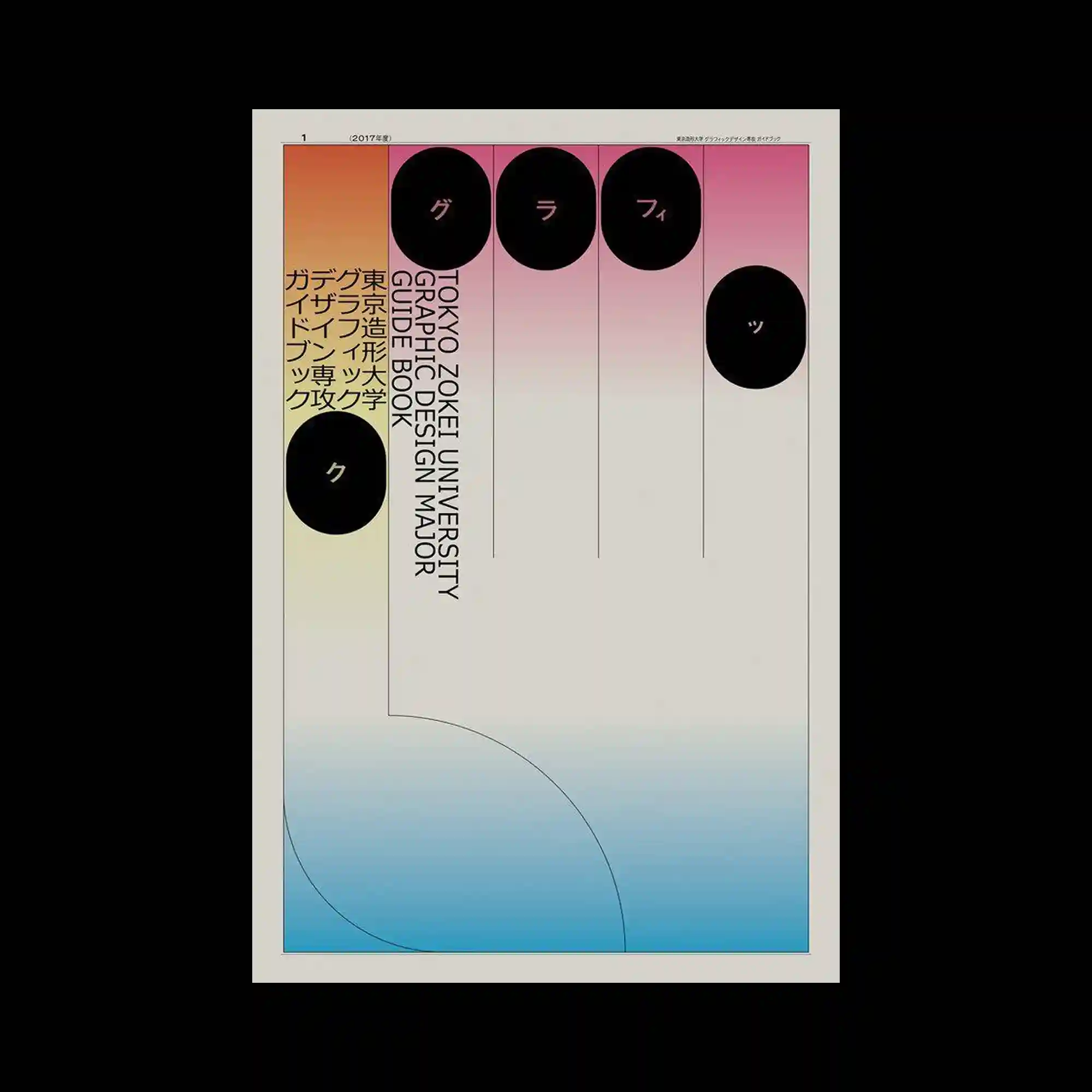
A minimal grid structure defines the composition through evenly spaced vertical divisions and generous open space. Black circular forms punctuate the upper portion of the layout, introducing rhythm while contrasting sharply against the soft gradient background. Vertical typography aligns precisely with the grid, reinforcing a disciplined editorial structure. Subtle geometric curves in the lower section soften the rigid framework and balance the overall composition.
균일한 세로 분할과 넓은 여백으로 이루어진 미니멀한 그리드가 화면의 기본 구조를 형성함. 상단의 검은 원형 요소들이 일정한 리듬을 만들며 부드러운 그라디언트 배경과 강한 대비를 이룸. 세로 방향의 타이포그래피는 그리드에 정밀하게 맞춰져 에디토리얼한 질서를 강조함. 하단의 완만한 곡선 도형이 직선 중심의 구조를 부드럽게 완화하며 균형을 맞춤.
极简网格通过均匀的纵向分栏与宽阔留白构成整体框架。顶部的黑色圆形元素形成规律节奏,并与柔和渐变背景产生鲜明对比。竖排文字严格对齐网格,加强了编辑设计般的秩序感。下方柔和的几何曲线缓和了整体的直线结构,使画面更加平衡。