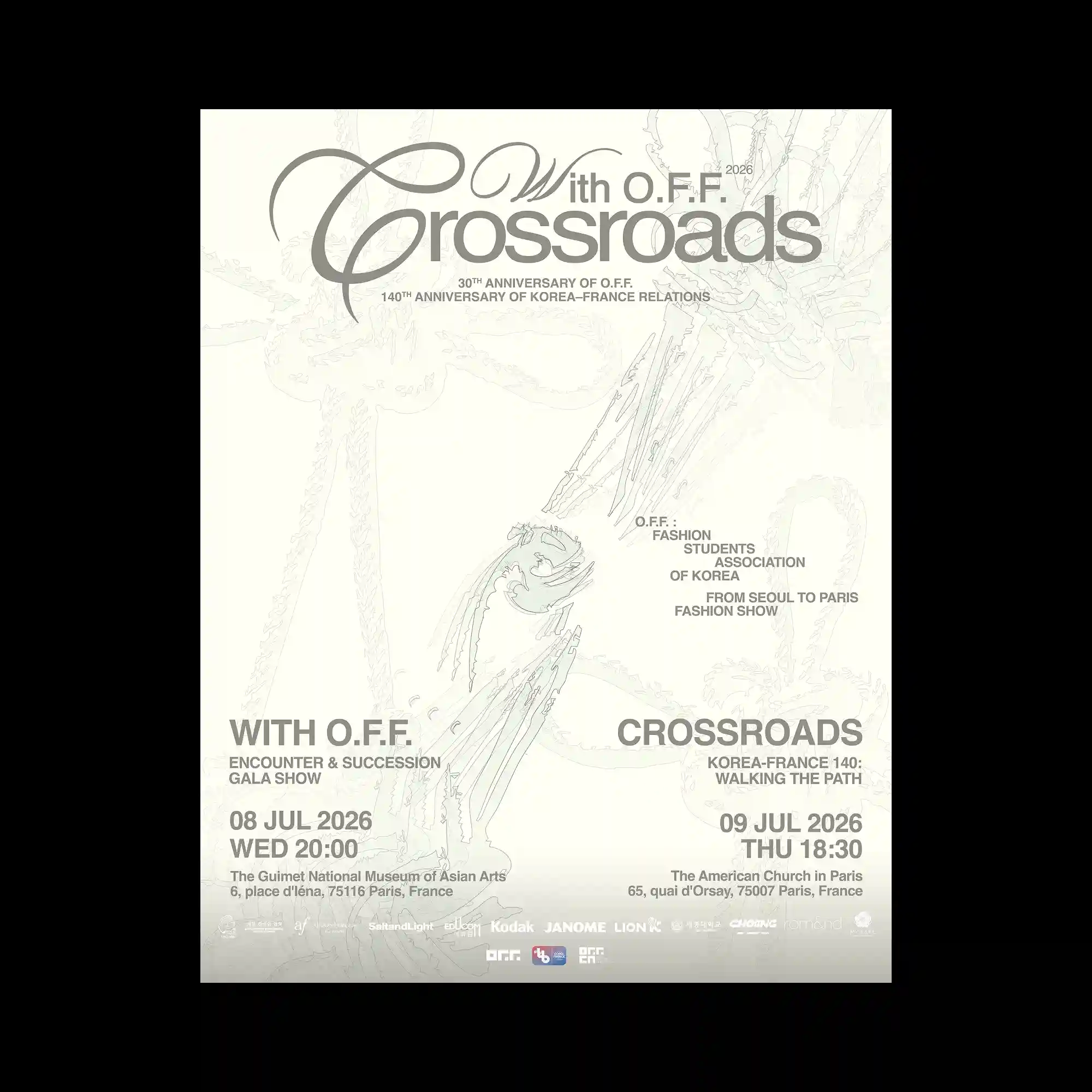
Elegant typography dominates the composition through an interplay of oversized serif letterforms, flowing calligraphic strokes, and condensed sans-serif text arranged across multiple scales. Delicate linear illustrations spread softly beneath the typography, adding subtle texture without competing with the primary hierarchy. Information is divided into balanced clusters that create a clear visual rhythm while allowing generous negative space to unify the layout. A restrained monochromatic palette emphasizes contrast through weight, transparency, and typographic proportion rather than color.
커다란 세리프 타이포그래피와 유려한 캘리그래피 획, 응축된 산세리프 텍스트가 다양한 크기로 배치되어 화면 전체의 중심을 형성함. 섬세한 선 드로잉이 타이포그래피 아래에 은은하게 겹쳐지며 주목성을 해치지 않는 질감을 더함. 정보는 균형 잡힌 여러 블록으로 나뉘어 시각적인 리듬을 만들고 넉넉한 여백이 전체 구성을 정돈함. 절제된 단색 계열은 색상보다 굵기와 투명도, 타이포그래피 비례를 통해 대비를 강조함.
大型衬线字体、流畅的书法笔触以及紧凑的无衬线文字以不同尺度交织排列,形成整体视觉核心。细腻的线描图形柔和地铺陈于文字下方,在不干扰层级的同时增加了纹理感。信息被划分为多个均衡的模块,建立清晰的视觉节奏,并通过充足留白保持整体统一。克制的单色配色更多依赖字重、透明度与字体比例来塑造对比,而非色彩本身。