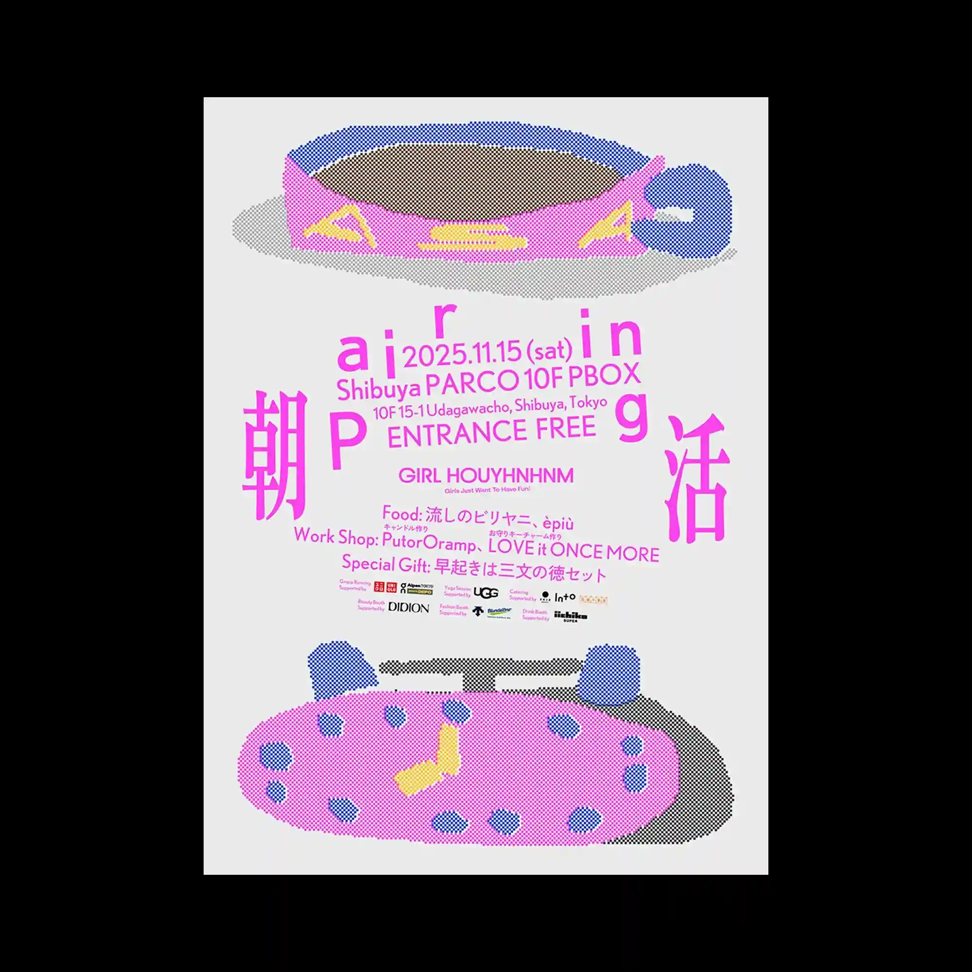
Two large object-like illustrations occupy the upper and lower sections of the composition, framing a dense block of centrally aligned typography. The illustrations are constructed from simplified geometric shapes and dotted textures, creating a playful visual language with a tactile quality. Bright accent colors contrast against the neutral background and guide attention through the composition. The balanced symmetry between the upper and lower elements reinforces the poster’s structured and approachable character.
상단과 하단의 대형 오브젝트 일러스트가 중앙의 밀집된 타이포그래피 영역을 감싸며 안정적인 구성을 형성함. 단순한 기하학 형태와 점묘 질감으로 구성된 오브젝트는 장난스럽고 촉각적인 인상을 전달함. 밝은 포인트 컬러는 중립적인 배경과 대비되며 시선을 자연스럽게 유도함. 위아래 요소의 균형 잡힌 배치는 화면의 구조적 안정감과 친근한 분위기를 강화함.
上下两组大型物件插图围绕中央密集的文字区域展开,形成稳定而清晰的构图。由简化几何形状与点状纹理构成的图形带来轻松且富有触感的视觉印象。鲜艳的强调色与中性色背景形成对比,并有效引导视觉动线。上下元素之间的对称平衡强化了整体结构感,同时赋予画面亲切而易接近的气质。