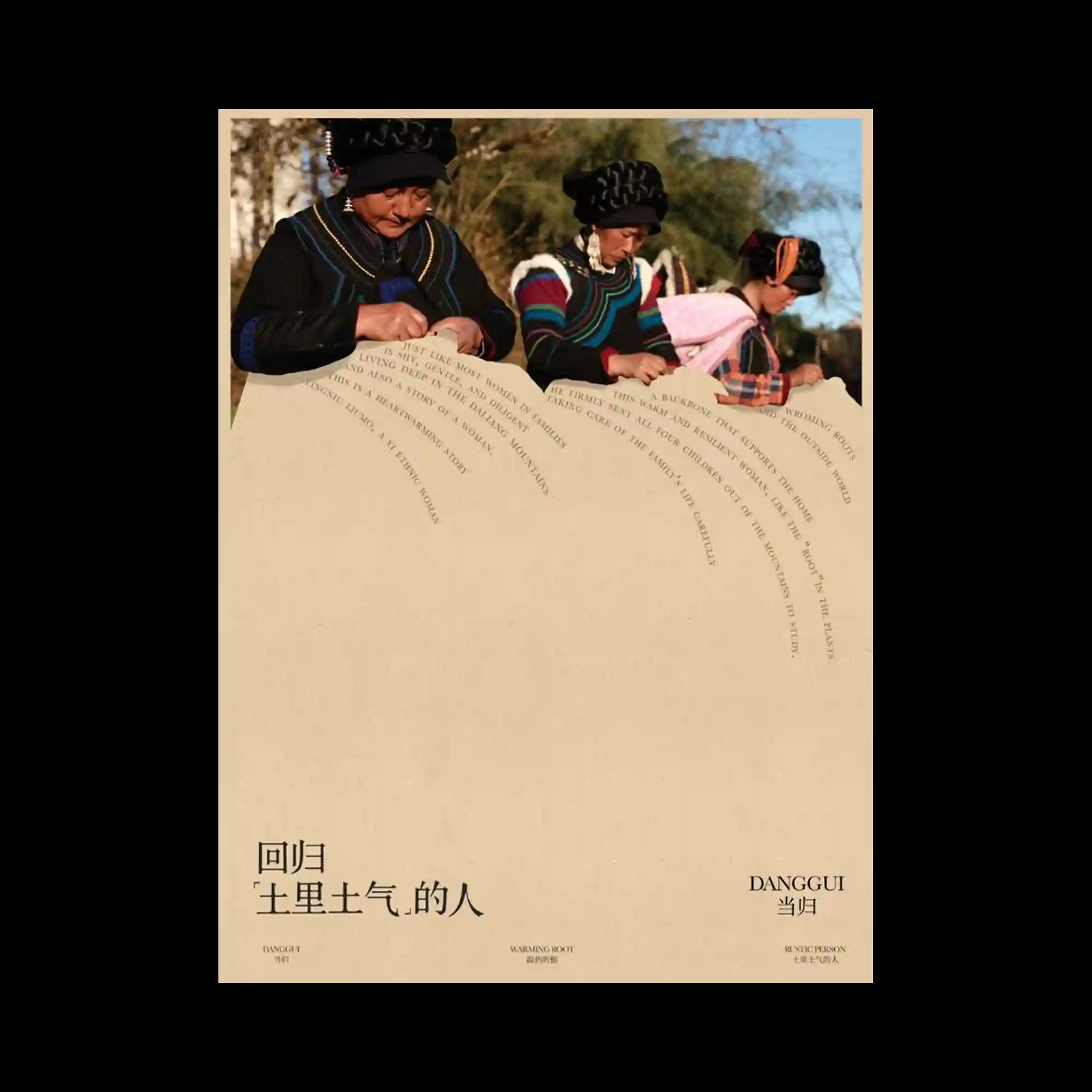
A large photographic image occupies the upper portion of the composition while expansive empty space dominates the lower area. Curving lines of text flow across the boundary between image and open space, acting as subtle connectors between the two visual zones. The layout emphasizes proportion and balance, allowing the image to breathe while maintaining a strong sense of structure. Sparse typography and generous margins create a calm and contemplative visual rhythm.
상단의 사진 이미지와 하단의 넓은 여백이 뚜렷하게 대비되며 균형 잡힌 화면을 형성함. 곡선을 따라 배치된 텍스트는 이미지와 빈 공간 사이를 연결하는 시각적 매개체 역할을 함. 화면은 비율과 여백을 적극적으로 활용하여 안정적이고 여유로운 구조를 만들어냄. 절제된 문자 배치와 넓은 공간감이 차분하고 사색적인 리듬을 형성함.
上方的大幅摄影图像与下方宽阔留白形成鲜明对比,并构建出平衡稳定的版面结构。沿曲线排列的文字成为连接图像区域与空白区域的视觉纽带。整体设计充分利用比例与留白,使画面显得开放而有秩序。克制的文字布局与宽松空间共同营造出宁静而富有思考感的视觉节奏。