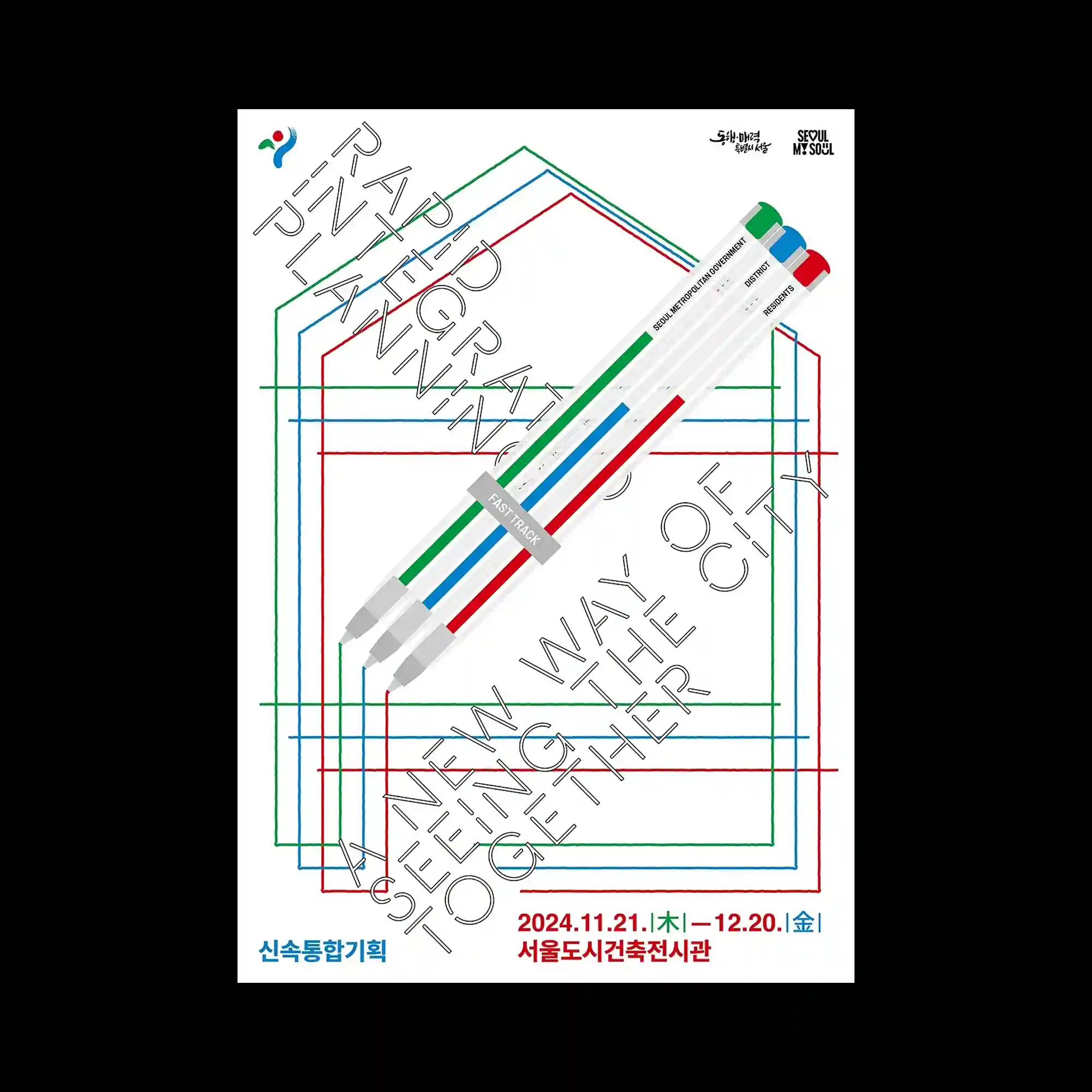
A dense typographic composition unfolds across the surface through layered columns of text, oversized letterforms, and intersecting editorial structures. Thin hand-drawn curves sweep across the layout in multiple directions, creating a loose spatial framework that contrasts with the rigid alignment of the typography. Variations in scale establish a hierarchy between dominant headlines and clusters of smaller textual elements, producing a dynamic rhythm throughout the composition. The restrained monochromatic palette emphasizes the relationship between line, spacing, and typographic density while allowing the overlapping forms to define the visual depth.
대형 타이포그래피와 작은 텍스트 군집, 그리고 다층적인 편집 구조가 화면 전반에 촘촘하게 배치된 구성임. 손으로 그린 듯한 얇은 곡선이 여러 방향으로 교차하며 흐르면서 정돈된 타이포그래피와 대비되는 유기적인 공간감을 형성함. 서로 다른 크기의 문자 요소들이 강한 위계와 리듬을 만들며 시선이 자연스럽게 화면 곳곳을 이동하게 함. 절제된 단색 구성은 선과 여백, 그리고 타이포그래피의 밀도 차이를 강조하며 중첩된 형태의 깊이를 부각함.
大型字体、小型文本群组以及多层次的编辑结构密集地分布于画面之中。细长且带有手绘感的曲线从多个方向穿过版面,与规整排列的文字形成有机与秩序之间的对比。不同尺度的文字元素建立了鲜明的层级关系,使视觉动线在画面中持续流动。克制的单色配色进一步强化了线条、留白与文字密度之间的关系,并通过重叠的形态营造出丰富的空间深度。