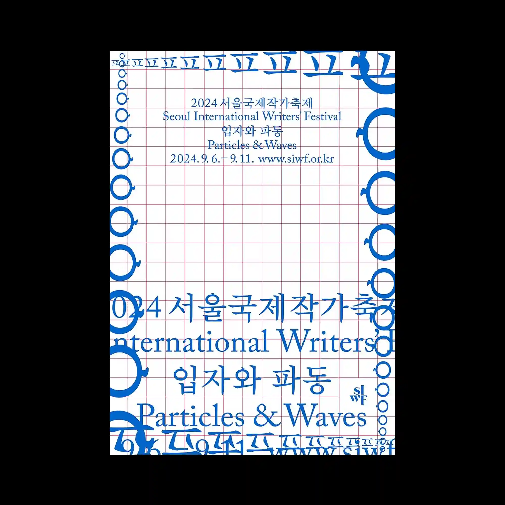
Thin red grid lines divide the composition into a precise modular field while vivid blue typography expands around the outer edges in repeated circular forms. The center area remains relatively open, allowing the layered Korean and English text to float calmly within the structured framework. Repetition of circular symbols along the borders creates a rhythmic optical frame that gradually changes in scale. The poster combines technical grid precision with elegant typographic spacing and restrained visual density.
얇은 붉은 그리드 라인이 화면 전체를 정교한 모듈 구조로 나누고 선명한 블루 타이포그래피가 가장자리를 따라 반복적인 원형 형태로 확장됨. 중앙 영역은 비교적 넓게 비워져 있어 한글과 영문 텍스트가 구조 안에서 차분하게 떠 있는 느낌 형성함. 테두리를 따라 반복되는 원형 심볼이 점진적으로 크기를 변화시키며 리드미컬한 시각 프레임 만들어냄. 기술적인 그리드 정밀함과 우아한 타이포 간격, 절제된 밀도가 조화롭게 결합됨.
纤细的红色网格线将画面划分为精确的模块结构,鲜明的蓝色字体则以重复圆形形式沿边缘扩展。中央区域保持较大留白,使韩文与英文文字能够在结构中平静漂浮。边缘不断变化尺度的圆形符号形成具有节奏感的视觉边框。海报将技术性的网格精度、优雅的文字间距与克制的视觉密度结合在一起。