Large white bilingual typography fills black rectangular modules that interlock across the poster like shifting panels. Curved white organic shapes flow between the blocks, softening the rigid grid and creating a continuous visual movement beneath the text. The condensed sans-serif typography overlaps tightly, causing different language systems to collide into a dense informational surface. Strong contrast and minimal color usage emphasize the structural relationship between typography, negative space, and modular geometry.
거대한 흰색 이중언어 타이포그래피가 검은 직사각형 모듈 안을 가득 채우며 서로 맞물리는 패널 구조 형성함. 곡선형의 흰 유기적 형태가 블록 사이를 흐르며 단단한 그리드 구조를 부드럽게 연결하고 연속적인 움직임 만들어냄. 압축된 산세리프 타이포그래피가 촘촘히 겹쳐지며 서로 다른 언어 체계가 하나의 밀도 높은 정보 표면처럼 충돌함. 강한 대비와 최소한의 컬러 사용이 타이포그래피와 여백, 모듈 구조 사이의 관계 강조함.
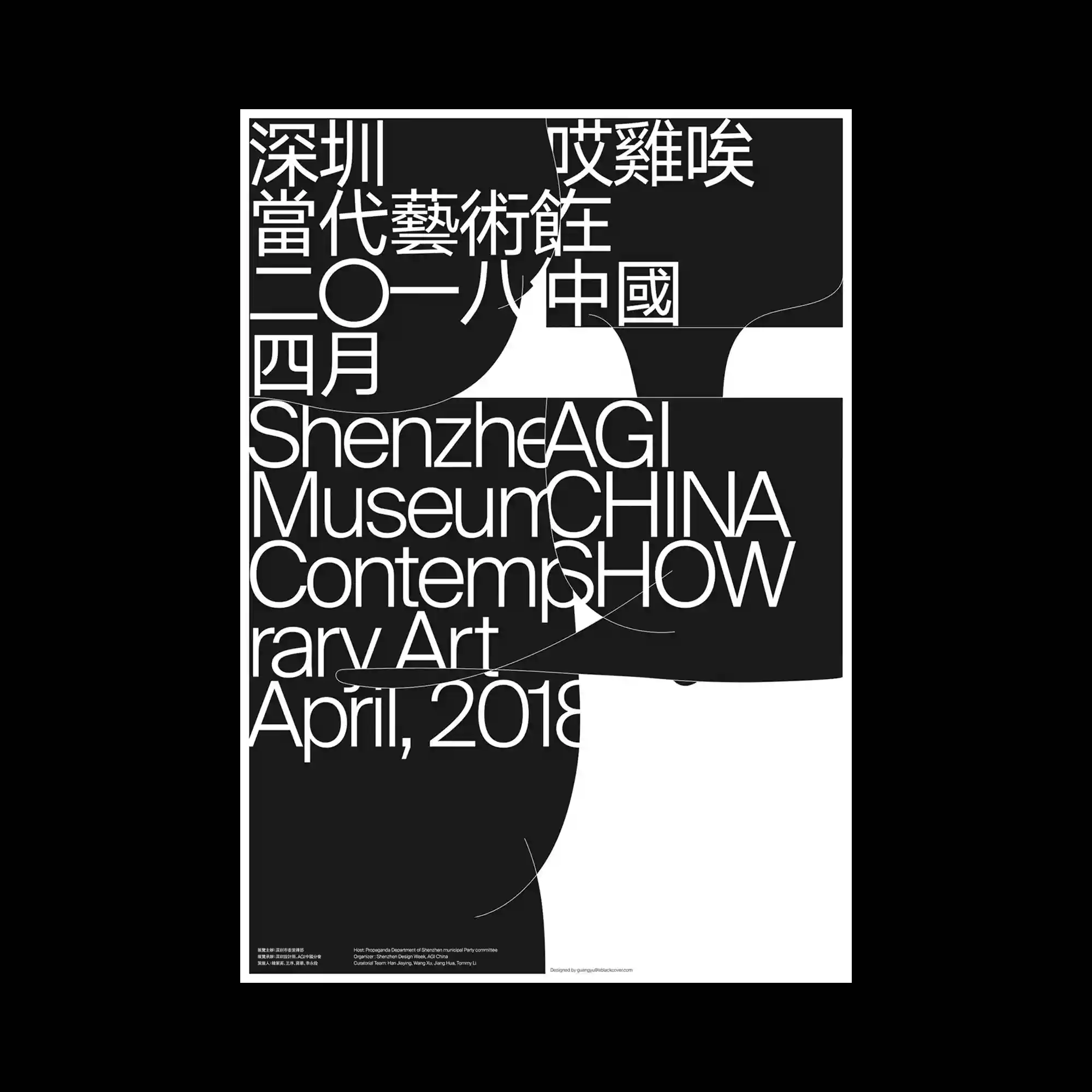
巨大的白色双语字体填满黑色矩形模块,并像拼接面板般彼此交错。流动的白色有机曲线穿梭于模块之间,缓和了坚硬的网格结构,并形成连续的视觉运动。压缩式无衬线字体紧密重叠,使不同语言系统碰撞成高密度的信息表面。强烈的黑白对比与极简配色突出排版、留白与模块几何之间的结构关系。