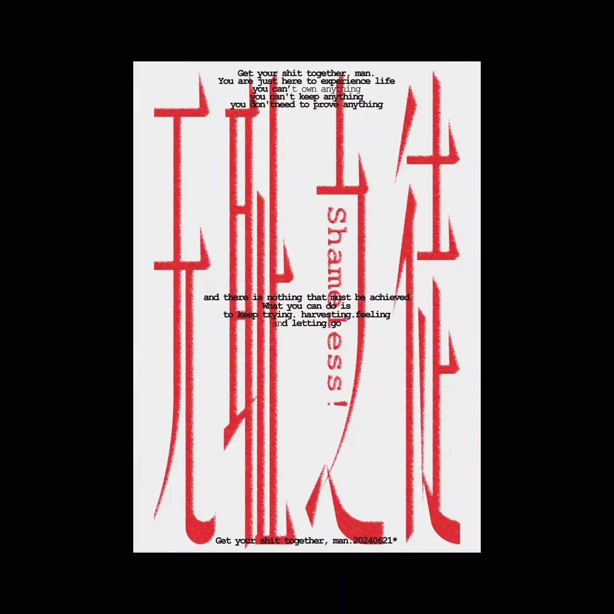
Tall distorted red letterforms stretch vertically across the composition, creating an aggressive typographic structure with sharp terminals and uneven proportions. Small black text fragments are layered over the oversized characters, introducing a secondary narrative rhythm that contrasts with the monumental scale beneath. The rough texture around the red typography gives the forms a dry, screen-printed appearance with slight visual vibration. Extreme verticality and compressed spacing transform the typography into an abstract architectural surface rather than readable text.
길게 왜곡된 붉은 문자 형태가 화면 전체를 세로로 가르며 날카로운 획 끝과 불균형한 비율의 공격적인 타이포그래피 구조 형성함. 작은 블랙 텍스트 조각들이 거대한 문자 위에 겹쳐지며 아래의 압도적인 스케일과 대비되는 서브 리듬 만들어냄. 붉은 타이포 주변의 거친 질감이 마른 실크스크린 같은 인상과 미세한 떨림감 부여함. 극단적인 세로 비율과 압축된 간격이 문자 자체를 읽기보다는 추상적인 건축 구조처럼 느껴지게 만듦.
细长而扭曲的红色字形纵向贯穿整个画面,形成带有尖锐收笔与不规则比例的强烈排版结构。细小的黑色文字碎片叠加在巨大字形之上,与下方压迫性的尺度形成第二层节奏。红色字体边缘的粗糙纹理带来类似丝网印刷的干燥质感与轻微震动感。极端的纵向比例与压缩间距让文字更像抽象建筑结构,而非单纯可阅读内容。