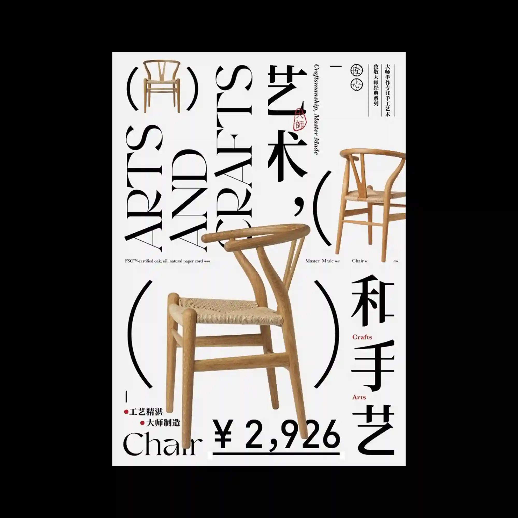
A series of wooden chair photographs are arranged across the composition at different scales, creating a product-focused layout with strong spatial variation. Oversized serif typography stretches vertically and horizontally through the poster, interacting directly with the furniture silhouettes and framing them with curved graphic brackets. Thin informational text and small red accents introduce a catalog-like precision while maintaining a refined editorial atmosphere. The contrast between the warm wood texture and the sharp black typography produces a clean yet expressive visual balance.
서로 다른 크기의 원목 의자 사진이 화면 전반에 배치되며 제품 중심의 공간감 있는 레이아웃 구성함. 과장된 세리프 타이포그래피가 세로와 가로 방향으로 길게 확장되며 의자 실루엣과 직접적으로 맞물리고 곡선형 그래픽 괄호 요소가 이를 감쌈. 얇은 정보 텍스트와 작은 붉은 포인트가 카탈로그 같은 정밀함 추가하면서도 세련된 에디토리얼 분위기 유지함. 따뜻한 목재 질감과 날카로운 블랙 타이포그래피의 대비가 깔끔하면서도 강한 시각적 균형 형성함.
不同尺度的木质椅子照片分布在画面之中,形成以产品为中心并富有空间变化的版式。夸张的衬线字体在纵向与横向大幅延展,与椅子的轮廓直接交织,并被弧形图形括号所包围。细小的信息文字与少量红色点缀带来目录般的精确感,同时保持精致的编辑气质。温暖的木纹材质与锐利的黑色字体形成鲜明对比,营造出干净却富有表现力的视觉平衡。