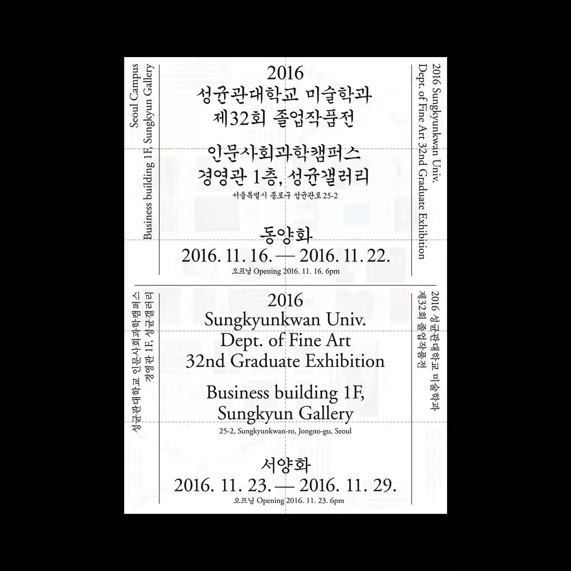
A rigid exhibition layout is divided into symmetrical sections by thin construction lines and vertical text columns. Serif and handwritten Korean typography coexist within the same grid, producing tension between formal institutional structure and personal expression. Large date typography anchors the center while mirrored information blocks stabilize the upper and lower halves. The pale background imagery remains almost invisible, functioning as subtle texture beneath the precise composition.
얇은 가이드선과 세로 텍스트 열로 구성된 대칭 구조가 엄격한 전시 레이아웃을 형성함. 세리프 영문과 손글씨 형태의 한글이 동일한 그리드 안에서 공존하며 제도적 구조와 개인적 표현 사이의 긴장감을 만듦. 중앙의 큰 날짜 표기가 중심축 역할을 하며 상하 정보 블록의 균형을 잡음. 희미한 배경 이미지는 거의 보이지 않는 질감처럼 작동하며 정교한 구성 아래에 깔려 있음.
由细线与纵向文字列构成的对称结构形成了严格的展览式版面。衬线英文与手写感韩文共存于同一网格中,在制度化结构与个人表达之间产生张力。中央的大号日期文字成为视觉轴心,使上下信息区保持稳定平衡。背景中的淡化图像几乎不可见,仅作为精细排版下方的微弱纹理存在。