Thin black curves sweep across the composition in large elliptical motions, functioning simultaneously as arrows, pathways, and typographic guides. Vertical boxed text columns positioned along both sides create a rigid frame that contrasts with the fluid motion of the central lines. Small labels and directional markers are distributed sparsely within the empty space, reinforcing the feeling of navigational graphics or transit diagrams. A soft gradient transition near the bottom edge introduces a subtle atmospheric glow beneath the otherwise minimal monochrome structure.
얇은 검은 곡선이 화면을 크게 감싸며 타원형 궤적을 이루고 있고, 화살표이자 경로이자 타이포그래피 가이드처럼 기능하고 있음. 양쪽 가장자리에 배치된 세로형 박스 텍스트는 중앙의 유동적인 선 구조와 대비되는 단단한 프레임 역할을 하고 있음. 작은 라벨과 방향 표시 요소가 넓은 여백 속에 드물게 배치되어 있어 교통 다이어그램이나 내비게이션 그래픽 같은 인상을 강화하고 있음. 하단의 은은한 그라디언트는 미니멀한 흑백 구조 아래에 부드러운 공기감을 추가하고 있음.
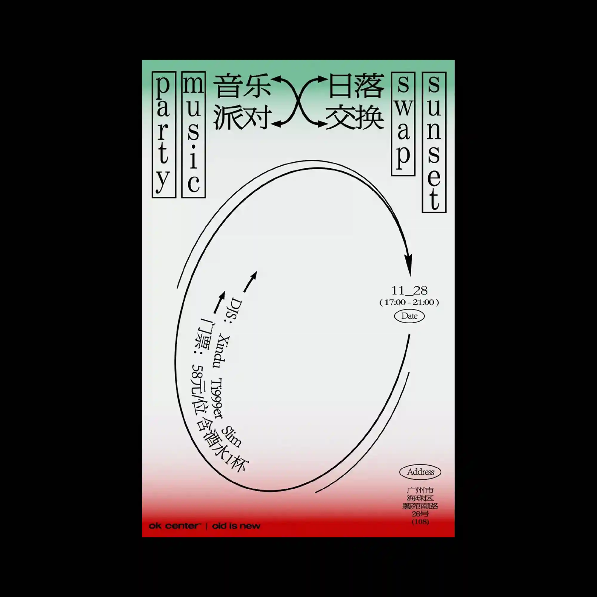
纤细的黑色曲线以巨大的椭圆轨迹贯穿画面,同时像箭头、路径与排版导向线一样发挥作用。左右两侧竖向排列的文字框形成稳定边界,与中央流动感极强的曲线形成鲜明对比。大量留白中零散分布的小型标签与方向标记,使整张海报带有导航图或交通线路图般的视觉感受。底部柔和的渐变则在极简黑白结构之下加入了一层轻微的氛围光感。