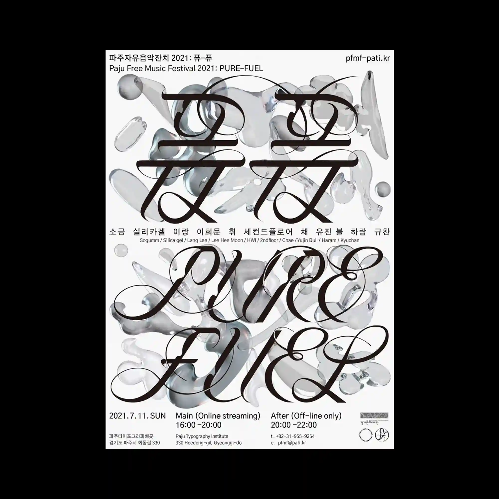
Large flowing serif typography spans across the composition with exaggerated curves and extended strokes, forming a dominant visual layer. Behind the text, semi-transparent amorphous shapes resembling liquid glass are scattered, creating depth through overlap and refraction-like distortion. The contrast between sharp typographic edges and soft organic forms enhances spatial layering. The layout integrates expressive typography with translucent volumetric elements, resulting in a dense yet balanced composition.
유려한 곡선과 길게 늘어진 획을 가진 세리프 타이포그래피가 화면 전반을 가로지르며 주요 레이어를 형성함. 뒤에는 반투명하고 유동적인 형태가 흩어져 겹침과 왜곡을 통해 깊이감을 만듦. 날카로운 문자 형태와 부드러운 유기적 형태가 대비되며 공간 레이어를 강화함. 타이포그래피와 반투명 입체 형태가 결합된 밀도 높은 구성임.
大幅延展的衬线字体以夸张曲线贯穿画面形成主要视觉层。其后叠加半透明的液态有机形态,通过重叠与折射感产生空间深度。锐利字形与柔软形态形成对比强化层次结构。整体将表现性排版与透明体积元素结合,构建出密集而平衡的画面。