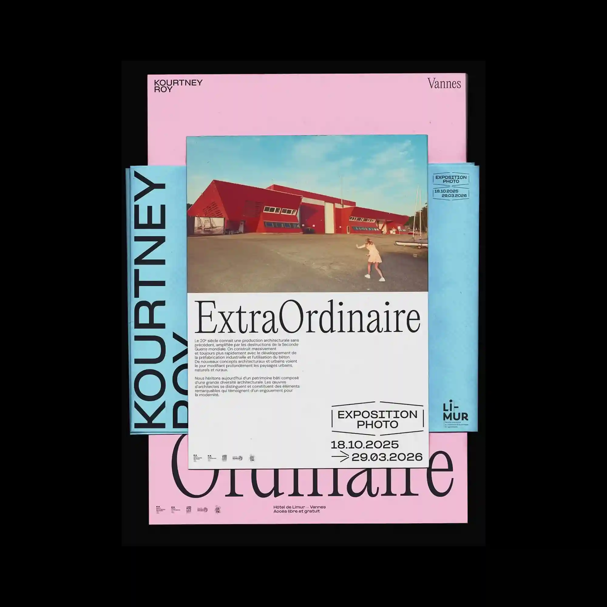
Multiple poster layers appear stacked with slight offsets, revealing contrasting pastel backgrounds behind the central sheet. The top poster features a wide photograph of a modern building placed above a large serif headline. Surrounding blocks of text and framed labels create a structured editorial layout that balances image and typography. The overlapping arrangement produces depth while maintaining a clean typographic hierarchy.
여러 장의 포스터가 겹쳐진 레이어 구조로 배치되어 파스텔 색 배경이 일부 드러남. 가장 위 포스터에는 건물 사진이 상단에 배치되고 그 아래에 큰 세리프 제목이 위치함. 주변에는 정보 텍스트와 라벨 프레임이 정리된 편집형 레이아웃을 형성함. 겹쳐진 구조가 깊이를 만들면서도 명확한 타이포그래피 위계를 유지함.
多张海报以轻微错位的方式叠放,露出不同的柔和色背景。最上层海报顶部放置建筑照片,下方是大型衬线标题。周围信息文字与框线标签构成整齐的编辑式排版。叠层结构在保持清晰排版层级的同时增加了空间深度。