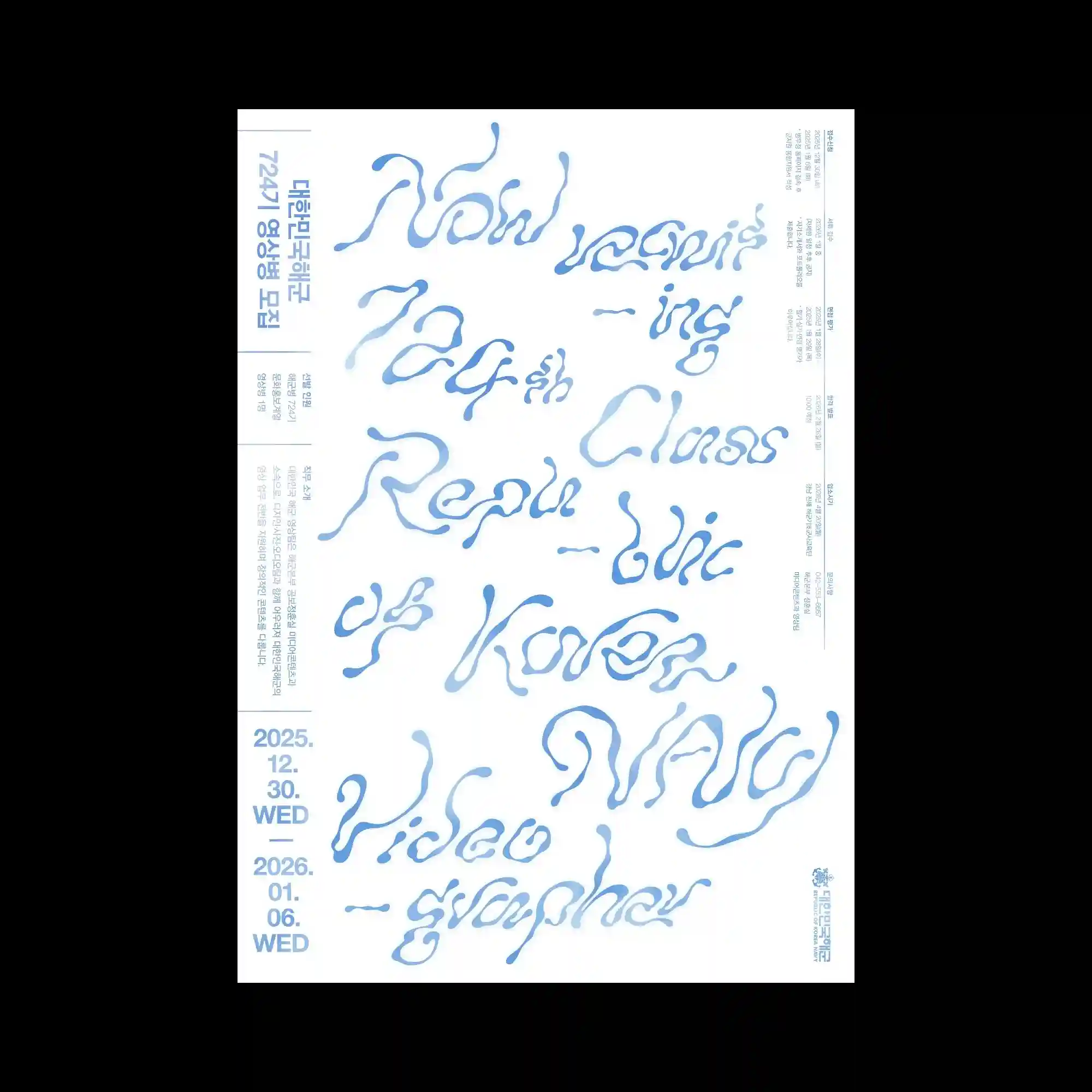
Fluid, hand-drawn lettering spreads across the poster in soft blue forms that resemble liquid or inflated shapes. The text appears irregular and organic, creating a playful contrast with the rigid vertical columns of small informational text along the edges. The central area is dominated by these flowing letterforms that twist and expand across the surface. This contrast between structured side typography and expressive central lettering produces a dynamic visual hierarchy.
부드러운 블루 색상의 손글씨 형태 타이포그래피가 액체처럼 흐르는 유기적 형태로 포스터 전반에 퍼져 있음. 글자는 불규칙하고 팽창된 형태로 표현되어 가장자리의 정렬된 세로 정보 텍스트와 대비를 이룸. 중앙 영역은 이러한 흐르는 문자 형태가 크게 확장되며 화면을 지배함. 구조적인 주변 텍스트와 표현적인 중앙 문자 사이의 대비가 역동적인 시각 위계를 형성함.
柔和蓝色的手绘字形在画面中扩展,呈现出类似液体或膨胀形状的流动感。文字形态不规则且有机,与边缘整齐排列的垂直信息文本形成对比。中央区域被这些流动的字形占据并不断延展。结构化的边缘排版与富有表现力的中央文字之间形成动态的视觉层级。