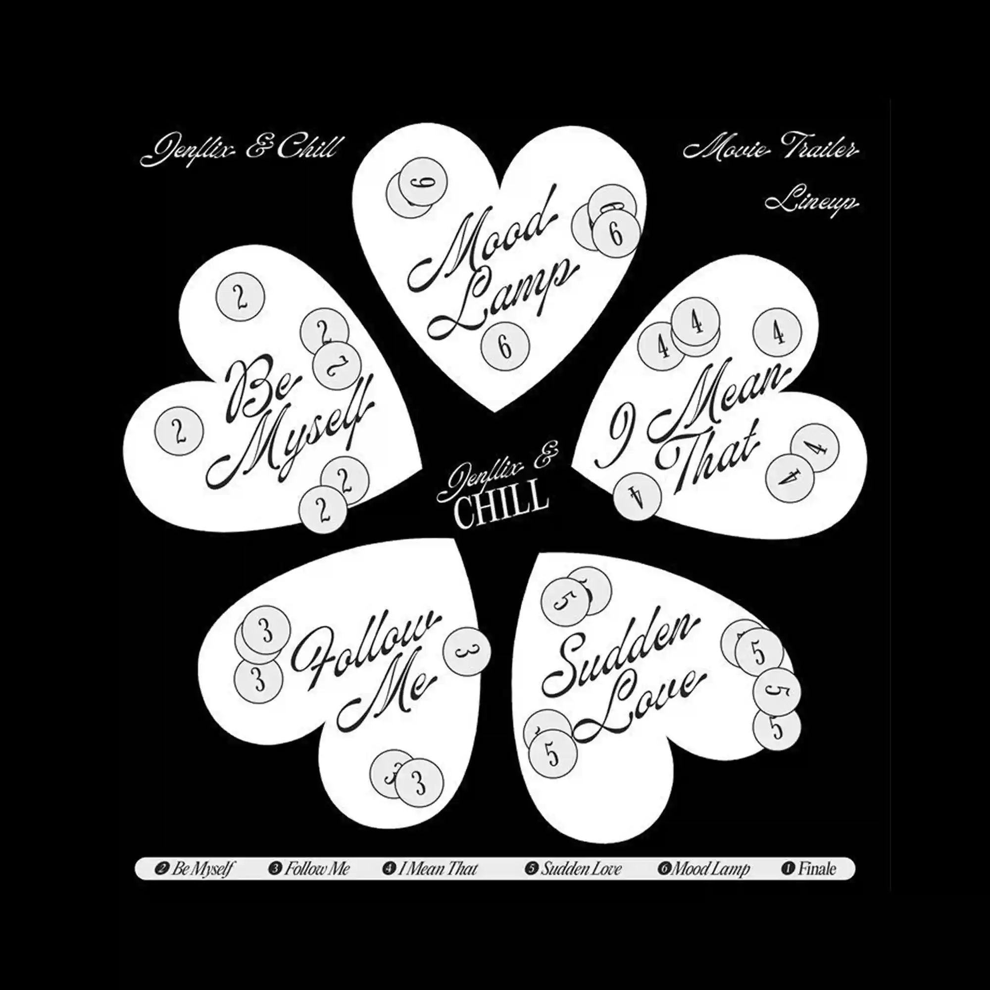
The layout centers on repeated heart-shaped forms arranged radially, creating a symmetrical yet playful structure. Handwritten-style lettering contrasts with the clean, solid shapes, adding a sense of softness and informality. Small circular markers with numbers are distributed across each shape, functioning as rhythmic visual accents rather than strict informational elements. A stark black background isolates the white forms, heightening clarity and graphic impact.
하트 형태가 방사형으로 반복 배치되어 대칭적이면서도 가벼운 구조를 만듦. 손글씨 느낌의 레터링이 단순하고 단단한 형태와 대비되며 부드러운 인상을 줌. 숫자가 들어간 작은 원형 요소들이 각 형태 위에 흩어져 리듬감을 형성함. 검은 배경 위에 흰색 요소만 배치되어 그래픽 대비와 집중도가 매우 높음.
画面以重复的心形图形为中心呈放射状排列,形成对称而轻快的结构。手写风格的文字与简洁坚实的形状形成对比,带来柔和与随意的感觉。带数字的小圆点分布在各个形状上,更多作为节奏性的视觉点缀。纯黑背景将白色形体完全孤立,强化了整体的图形清晰度与冲击力。