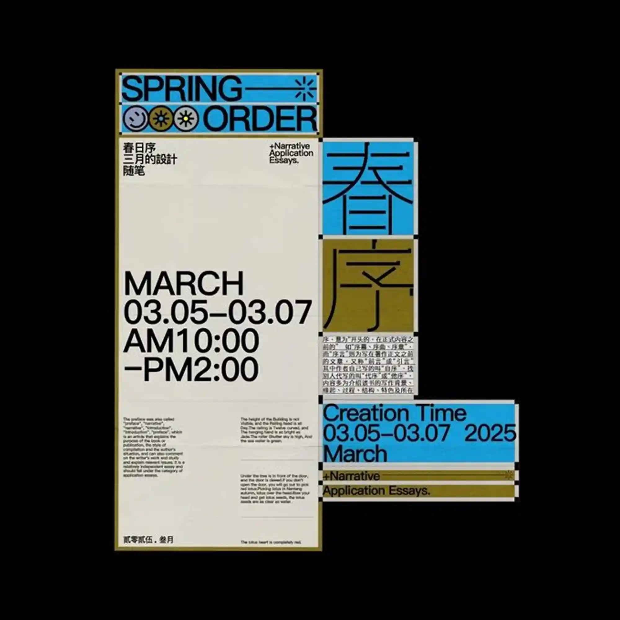
A modular poster system uses blocks of cream, blue, and olive tones arranged in offset panels. Bold sans-serif type dominates the left column, while smaller multilingual text fills secondary blocks. Icon-like symbols and thin rules act as separators between sections. The composition emphasizes hierarchy through scale and alignment shifts.
크림, 블루, 올리브 톤의 패널이 어긋난 블록 구조로 배치됨. 왼쪽에는 굵은 산세리프 타이포그래피가 크게 자리하고, 보조 영역에는 다국어 텍스트가 채워짐. 아이콘과 얇은 구분선이 섹션을 나눔. 크기와 정렬 변화로 위계를 드러냄.
由米色、蓝色与橄榄色模块组成的拼接式版面结构。左侧以大字号无衬线文字为主,其余区块填充多语言信息。符号化图标与细线用于区隔内容区域。通过尺度与对齐差异建立清晰层级。