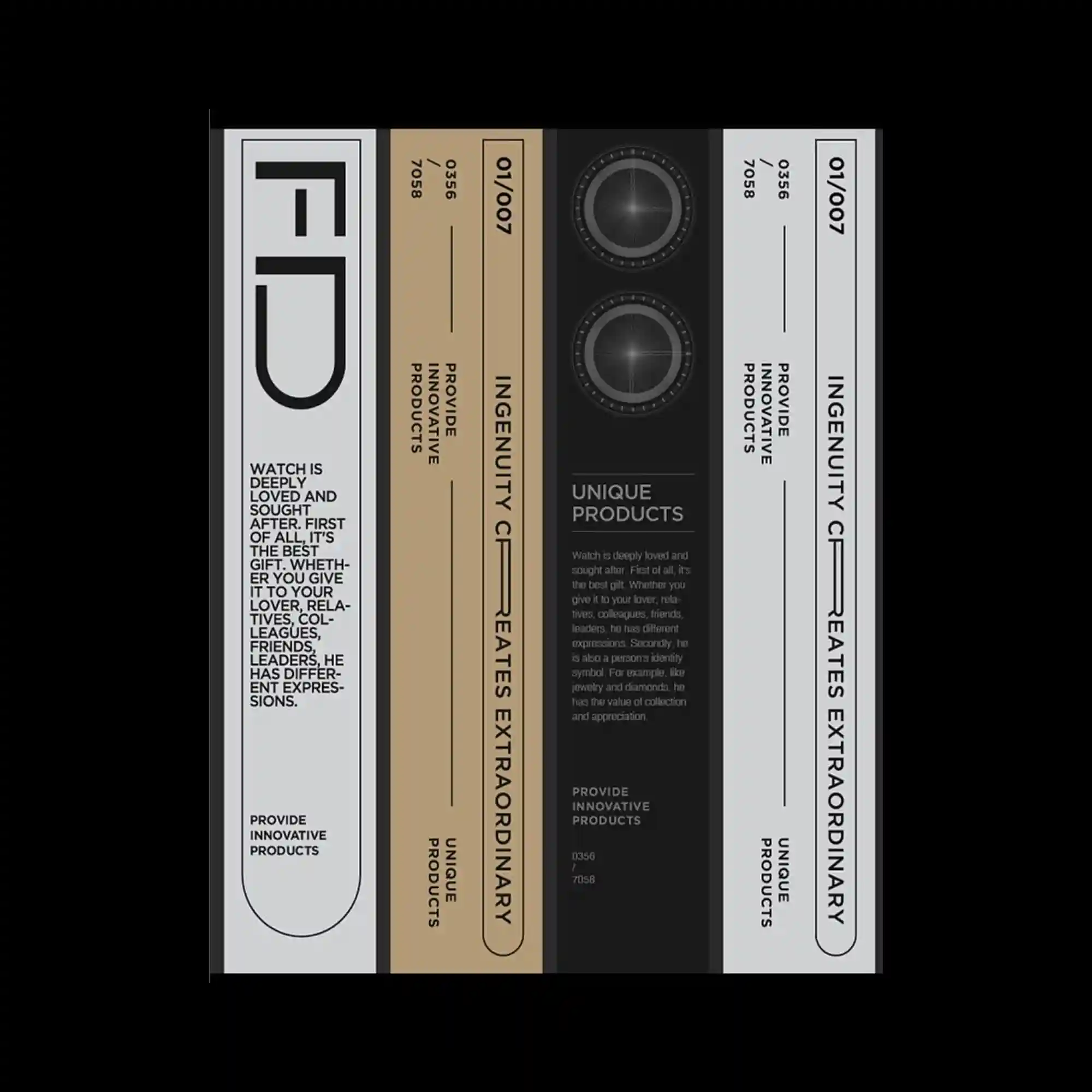
Tall vertical panels align side by side, each containing restrained typography and graphic indicators. A limited color palette and consistent proportions create a product-label-like system. Circular graphic elements introduce focal points within otherwise linear compositions. The design emphasizes precision, alignment, and serial variation.
세로로 긴 패널들이 나란히 배열되며 각 패널 안에 절제된 타이포그래피와 그래픽 표시가 포함됨. 제한된 색상과 일관된 비율로 제품 라벨 같은 시스템을 형성함. 원형 그래픽 요소가 직선 위주의 구성 속에서 시선을 모으는 포인트로 작용함. 정렬과 정확성, 연속적인 변주가 강조됨.
纵向排列的长条面板并列展开,每个面板包含克制的文字与图形标记。有限的配色与统一比例构建出类似产品标签的系统感。圆形图形元素在以线性为主的构图中形成视觉焦点。设计强调精确性、对齐关系与序列变化。