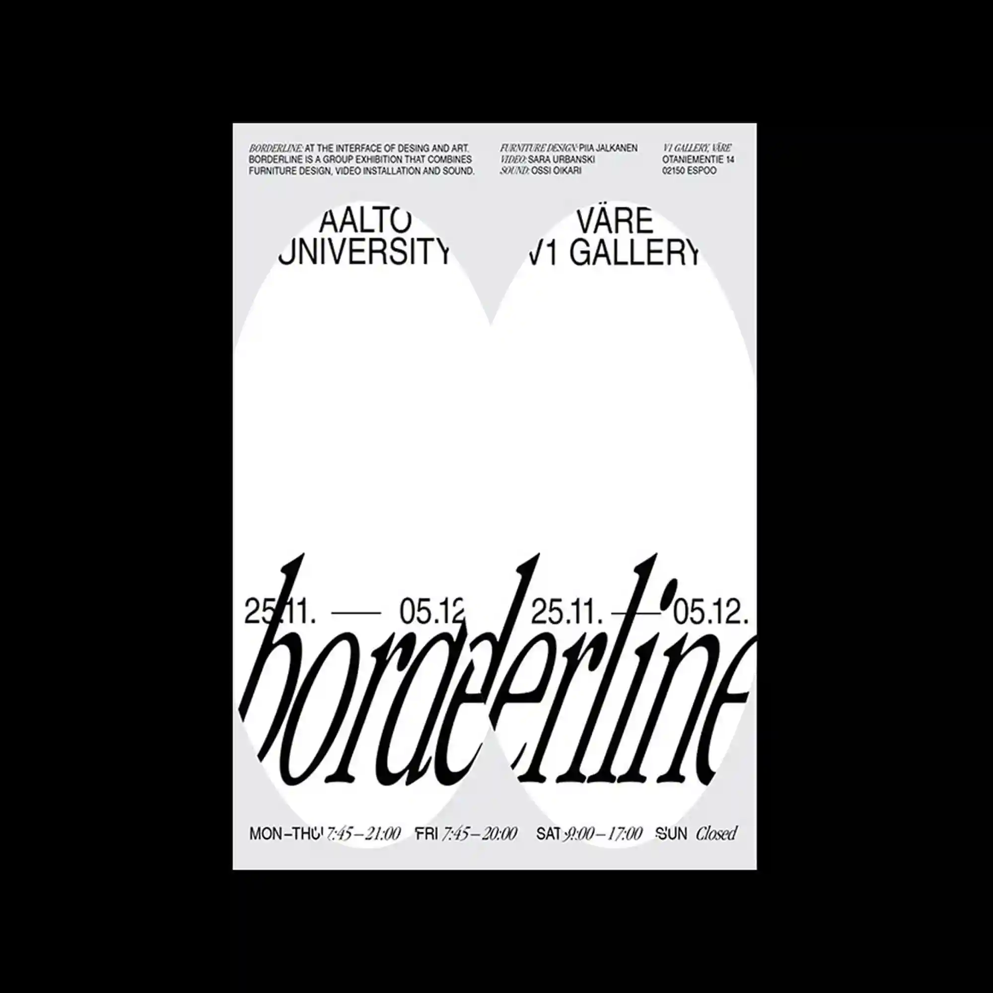
A minimal gray-and-white layout is structured around two large curved cut-out shapes that dominate the upper half. Bold sans-serif headings sit above each curve, while dense informational text is aligned along the top and bottom margins. A large italic word stretches across the center, partially masked by the shapes. The design relies on cropping, overlap, and typographic scale contrast.
회백색의 미니멀한 레이아웃 위에 상단을 차지하는 두 개의 큰 곡선 컷아웃 형태가 중심 구조를 이룸. 각 곡선 위에는 굵은 산세리프 제목이 놓이고, 상하단에는 정보성 텍스트가 정렬됨. 중앙에는 이탤릭체의 큰 단어가 형태에 의해 일부 가려짐. 크롭과 중첩, 타이포 스케일 대비가 특징임.
灰白色的极简版面由上半部分的两个大型弧形镂空形态构成视觉核心。粗体无衬线标题位于曲线之上,密集的信息文字沿着上下边缘排列。中央的大号斜体文字被形态部分遮挡。整体依赖裁切、叠加以及字体尺度的对比。