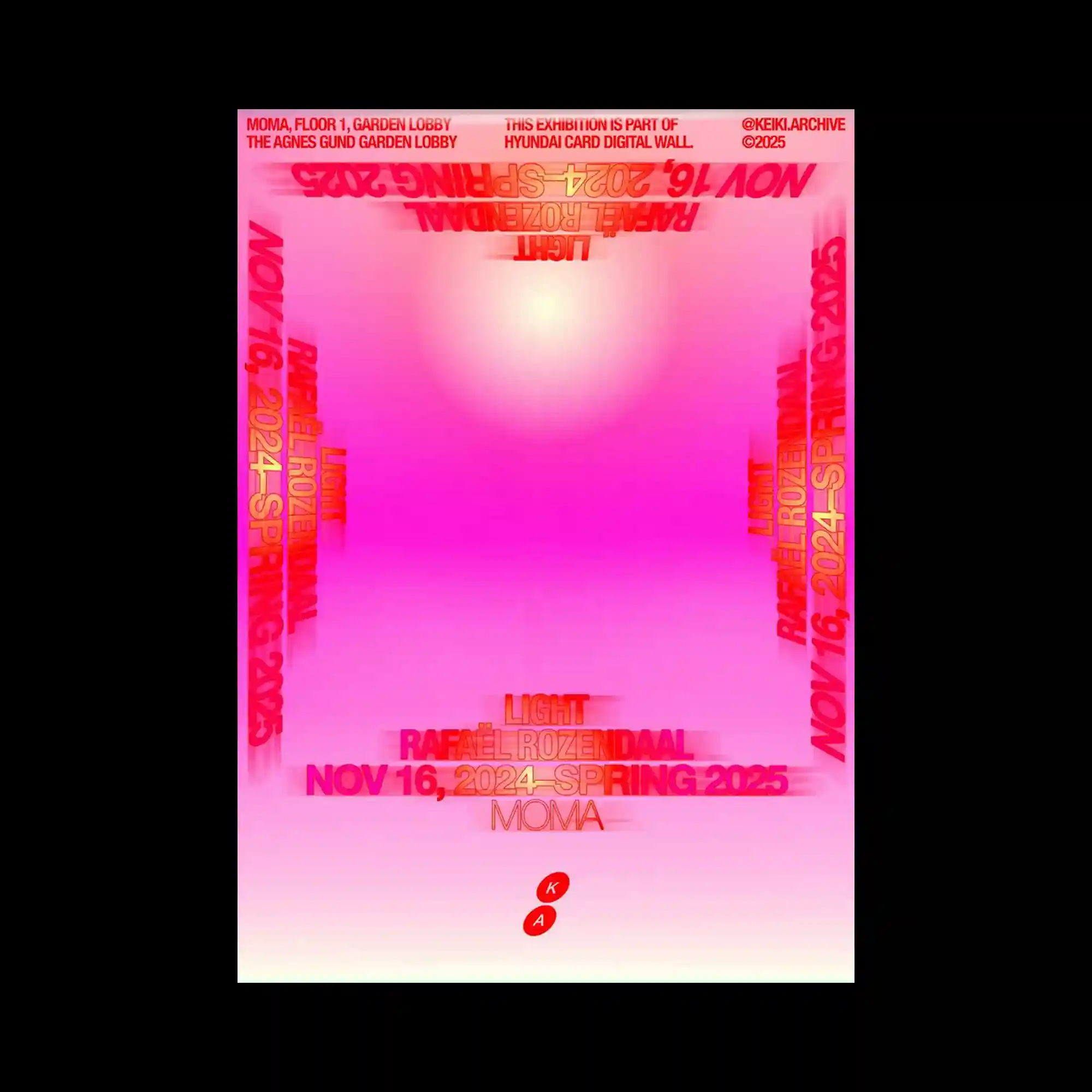
This design uses a radiant gradient background transitioning from deep pink at the edges to bright white at the center, producing an effect of glowing illumination. Text elements in red and orange are repeated along the borders, rotated and mirrored to form a frame around the central light. The typography appears slightly blurred or stretched, creating a sense of depth and motion. A small circular emblem sits near the bottom, anchoring the composition. The overall atmosphere is immersive, evoking both digital space and radiant energy.
짙은 분홍에서 흰색으로 번지는 그라데이션 배경이 빛나는 느낌 줌. 빨강과 주황 텍스트가 테두리를 따라 반복되며 회전, 반전되어 빛을 감싸는 틀 형성함. 글자는 흐려지거나 늘어난 듯해 입체감과 움직임 있음. 하단에는 작은 원형 기호가 배치되어 균형 잡음. 디지털 공간과 빛의 에너지를 동시에 떠올리게 함.
设计以渐变背景为主,从深粉色过渡到中央的亮白,营造出发光效果。红色与橙色文字环绕四周,旋转、镜像排列,形成框架。字体略带模糊或拉伸感,呈现出深度与运动感。底部的小圆形标志起到稳定作用。整体氛围沉浸式,联想到数字空间与光能。